The additional cost of a 5th Pantone color is not inevitable, but a financial trade-off: when mastered, it becomes a lever for profitability.
- Fixed offset setup costs make it prohibitive for small print runs (less than 2,000 units).
- Ignoring technical specifications (C vs. U, RGB vs. CMYK) leads to reprinting costs far higher than the initial savings.
- Finishes and special colors like silver directly increase the perceived value and memorability of your brand.
Recommendation: Audit every project: if the color is a critical brand asset, Pantone is an investment; otherwise, optimize with four-color process (CMYK) or digital printing.
You’ve received a printing quote and your eyes lock onto one line: “5th Pantone color.” The total price climbs, and the question becomes inevitable: is this expense truly justified? For a financial decision-maker, the temptation is high to cross out this option, perceiving it as a mere aesthetic luxury. After all, isn’t four-color process (CMYK) enough?
The usual answer is often limited to color fidelity, an argument that seems quite abstract when faced with concrete figures. However, reducing the debate to this single dimension ignores financial risks and hidden opportunity costs. The real issue is not just getting “the right color,” but protecting a core asset of your company—its brand identity—and avoiding production errors that can be very expensive.
This article is not an ode to Pantone. It is a strategic guide intended for managers. We will break down the costs, analyze the tipping points where one process becomes more profitable than another, and demonstrate how a special color, far from being an expense, can become a measurable investment. The goal is to give you the keys to transform this quote line item into an informed decision based on ROI and risk management, rather than simple artistic preference.
To help you navigate these technical choices with significant financial implications, we will explore in detail the factors influencing costs, solutions for achieving vibrant colors without blowing the budget, and the real impact of finishes on the perception of your business.
Summary: Justifying the Cost of Pantone Ink: A Guide for Decision-Makers
- Why is Pantone ink setup expensive for small print runs?
- How does Pantone 877 (Silver) ink add immediate perceived value?
- Pantone or CMYK: Which to choose to keep your orange vibrant?
- The mistake of choosing a Pantone “C” (Coated) for printing on matte “U” (Uncoated) paper
- When is 2-color Pantone printing cheaper than four-color process?
- Why does your corporate blue turn purple in print and how to avoid it?
- How do high-end finishes influence the perception of your business documents?
- Digital or Offset printing: Which to choose for a run of 500 to 10,000 copies?
Why is Pantone ink setup expensive for small print runs?
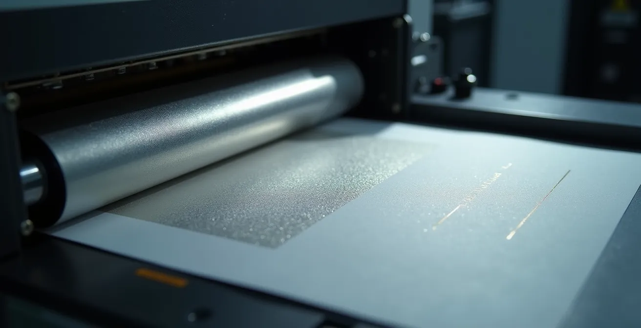
The main reason for the extra cost of a Pantone color in offset printing lies in the fixed preparation costs, or “setup” (makeready). Unlike four-color process where the four colors (Cyan, Magenta, Yellow, Black) are standard, each Pantone is a unique ink, custom-mixed. This process involves incompressible steps before the first sheet is even printed.
The printer must first deep-clean one of the press’s inking units to avoid contamination from a previous color. Next, they must mount the printing plate dedicated to that Pantone and load the new ink. The most time-consuming step is the setup: the meticulous adjustment of density and registration to ensure the color is perfectly uniform and matches the reference. This machine time and skilled labor represent a significant fixed cost. Indeed, according to Quebec printing practices, this setup can represent a fixed cost of $150 to $250 per Pantone color.
This cost is then amortized over the entire run. For 10,000 copies, this extra cost per unit is negligible. But for 500 brochures, it becomes prohibitive. It’s a simple break-even point calculation: below a certain volume, usually around 2,000 units, the cost per piece for offset with Pantone is often higher than that of a high-quality digital alternative. This is why dialogue with your estimator is crucial to evaluate the specific tipping point for your project.
How does Pantone 877 (Silver) ink add immediate perceived value?
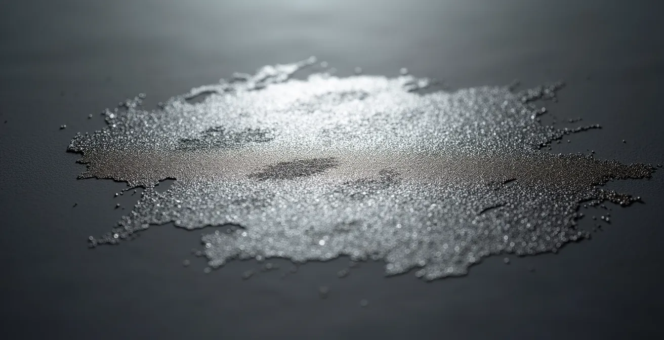
Certain Pantone inks, such as metallic colors, go beyond the simple question of chromatic fidelity. They introduce a texture and visual effect impossible to reproduce in four-color process. Pantone 877 (Silver) is a perfect example: it is not a simulation of gray, but an ink containing actual metallic particles that reflect light.
Integrating such an element on a business card, an annual report cover, or a corporate folder has a direct psychological impact. It instantly communicates a sense of prestige, quality, and attention to detail. For the recipient, a document that engages the senses of touch and sight with a metallic sheen immediately stands out from the mass of standard prints. This high-value perception justifies a premium brand positioning and reinforces the company’s credibility.
Of course, this addition comes at a cost, but it should be analyzed as an investment in “perceived value.” Other options for achieving a metallic effect exist, such as hot foil stamping, which is even more luxurious but also more expensive. Pantone 877 serves as an excellent middle ground between cost and visual impact.
Choosing a metallic ink is therefore a strategic decision. It’s not about “decorating” a document, but about giving it a status that positively influences the perception of your brand before the first line of text is even read.
Pantone or CMYK: Which to choose to keep your orange vibrant?
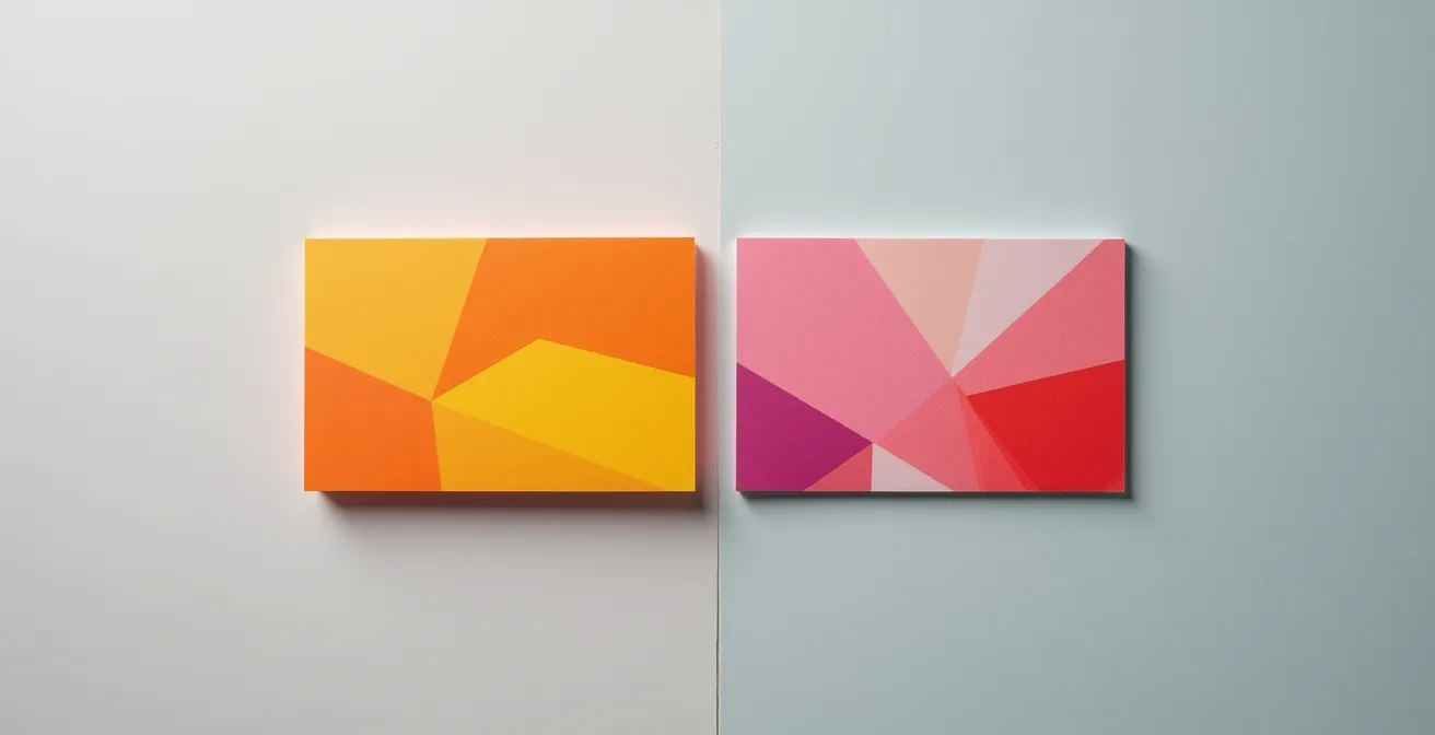
The choice between Pantone and four-color process (CMYK) becomes critical for bright, saturated colors like a vibrant orange, lime green, or reflex blue. The fundamental problem is that the gamut—the range of reproducible colors—of CMYK is narrower than that of the Pantone system. In other words, not all colors have a direct equivalent in four-color process.
To simulate a Pantone orange in CMYK, the printer mixes halftone dots of magenta and yellow. The result is often a duller, “dirtier” version of the original color. The vibrancy and purity of Pantone ink, which is a single, solid pigment, are lost. It is estimated that nearly 30% of the 2,161 Pantone colors cannot be accurately matched in CMYK printing. For a company whose brand identity relies on a bright color, skipping Pantone is a risky gamble that can lead to brand depreciation.
If your logo or primary corporate color is a dynamic orange, opting for CMYK simulation on important documents (business cards, brochures) would be akin to presenting a faded brand image. Here, the extra cost of Pantone becomes quality assurance, ensuring your visual identity is respected across all media. For internal or short-lived documents, CMYK simulation might be an acceptable compromise. The decision should therefore be made on a case-by-case basis, evaluating the document’s strategic importance.
Action Plan: Validating the Choice Between Pantone and CMYK
- Define the color’s role: Is it a central element of the brand identity (logo, packaging) or a simple graphic element?
- Evaluate the substrate: Is it a long-lasting document (annual report, business card) or a temporary medium (promotional flyer)?
- Request a proof: Always demand a certified color proof showing the CMYK simulation of your Pantone before launching full production.
- Consult the swatch book: Use a Pantone “Color Bridge” book that shows the Pantone color and its closest CMYK simulation side-by-side. This is the ultimate decision-making tool.
- Document the decision: Once the choice is validated, record the exact reference (e.g., Pantone 021 C) and its approved CMYK counterpart in your brand guidelines.
The mistake of choosing a Pantone “C” (Coated) for printing on matte “U” (Uncoated) paper
Here is a technical error that can turn hoped-for savings into a financial disaster: ignoring the difference between Pantone “C” and “U” references. These letters are not interchangeable. “C” stands for Coated and applies to papers with a smooth, shiny surface, while “U” stands for Uncoated and refers to matte, porous, and textured papers like recycled or offset paper.
The nature of the paper has a huge impact on how ink is absorbed and how color is perceived. On coated paper, the ink stays on the surface, resulting in vibrant colors and high contrast. On uncoated paper, the ink penetrates deeper into the fibers, which tends to darken and desaturate the color. Pantone C and U ink formulas are therefore slightly different to compensate for this effect. Using a “C” reference on “U” paper is a guarantee of disappointment: the color will come out dull, washed out, and will not match what you saw on your screen.
The cost of non-conformance associated with this error is considerable. It’s not a small imperfection, but a non-compliance that can invalidate an entire print run.
Testimonial: The Costly Mistake of Wrong Pantone Selection
A foundation had its annual report printed on matte recycled paper using the wrong Pantone code. The corporate blue intended as Pantone 293C came out washed out and dull. The cause? They should have specified Pantone 293U, which is formulated for uncoated paper. The result was final: a full reprint of all 5,000 copies had to be ordered, turning a simple specification error into a major financial loss and a communication delay.
The lesson for the decision-maker is clear: validating technical specifications with your designer and printer is not a detail. It is a crucial risk management step that prevents unforeseen expenses far higher than the initial cost of printing.
When is 2-color Pantone printing cheaper than four-color process?
There is a scenario where using Pantone is not an extra cost but a source of savings: two-color printing (duotone). Imagine a simple document, like a letterhead or a form, that only uses black text and a colored logo. CMYK logic would require using four printing plates, even if most of the inking units are barely working.
In contrast, a 2-color Pantone approach (for example, Pantone Black and your corporate Pantone) only requires two plates and two passes through the offset press. Fewer plates to burn, faster setup, and less handling mean lower production costs. This method can generate savings of 15% to 25% compared to a full four-color process run on an offset press.
This strategy is particularly relevant for companies with a strong visual identity based on one or two colors. A concrete case illustrates this advantage well.
Case Study: Economical Printing for an SME in Drummondville
A Quebec SME printing 5,000 letterheads in Black and Pantone Reflex Blue opted for 2-color spot offset printing. Compared to a CMYK quote, this decision saved approximately 20%. Furthermore, the Pantone black used offers superior density and depth compared to the “composite” black obtained by mixing the four CMYK colors, significantly improving the readability of fine text and reinforcing the document’s high-quality appearance.
The trade-off is simple: if your design is minimalist and doesn’t require color photographs, printing in 2 or 3 Pantone spot colors is often the most economical and high-quality solution. This is a perfect example where the “luxury” of Pantone becomes the most pragmatically financial option.
Why does your corporate blue turn purple in print and how to avoid it?
It’s one of the most common frustrations in printing: the beautiful deep blue approved on screen (in RGB mode – Red, Green, Blue) turns into a disappointing purple on paper (in CMYK mode). This phenomenon is generally not due to a printer’s error, but to a technical issue inherent in color space conversion.
Screens create colors by adding light (RGB), while printing creates them by subtracting light with inks (CMYK). Some bright blues in the RGB spectrum, rich in blue and red light, are at the limit of what CMYK can reproduce. During automatic conversion by design software, the algorithm struggles to find an equivalent and overcompensates by adding too much magenta to the CMYK formula. Result: the blue “shifts” to purple.
As one expert in the field points out, this is not a lack of skill but a technical reality. Studio Deligraph, in its guide, explains:
Automatic conversion from RGB to CMYK color space misinterprets certain blues. This is a technical issue, not printer incompetence.
– Studio Deligraph, Professional Printing Guide
The safest solution to avoid this risk is to use a Pantone ink for your corporate blue. Since the ink is pre-mixed to perfection, it guarantees a stable and faithful blue, regardless of the printing process. This is the only method that totally eliminates the risk of color shifting. If the budget dictates CMYK, you must then manually create a “safe” version of your blue by reducing the magenta value and validating the result via a certified color proof.
How do high-end finishes influence the perception of your business documents?
The impact of a document doesn’t stop at its colors. Finishes, or embellishments, play a major role in the tactile and visual experience, directly influencing how your brand is perceived. Options like spot UV varnish, embossing (relief), or hot foil stamping transform a simple print into a memorable communication object.
These techniques create a focal point and add a dimension of prestige. A study on premium business cards showed that a card with a special finish doubles the memorability rate compared to a standard card. In a networking or sales presentation context, this advantage is far from negligible. For a financial decision-maker, this translates to a better ROI for every document distributed.
Each finish conveys a different message and should be chosen based on your industry and the image you wish to project.
Case Study: Synergy Between Pantone and Embossing for a Boutique Hotel
A boutique hotel in Old Quebec decided to invest in business cards and welcome folders combining Pantone 877 silver printing with subtle embossing of the logo. This synergy between metallic sheen and tactile relief created a memorable experience for guests, aligned with the establishment’s premium positioning. Management noted that this attention to detail was often mentioned and contributed to generating 40% more guest referrals, demonstrating a tangible ROI.
The extra cost of these finishes must therefore be weighed against their ability to reinforce the brand message, justify high-end positioning, and differentiate from the competition. It is an investment in perception and memorability.
Key Takeaways
- The fixed setup cost in offset makes Pantone financially unwise for print runs under 2,000 copies.
- Protecting the integrity of a brand color (e.g., a bright orange) often justifies the Pantone extra cost to avoid image depreciation.
- Finishes like varnish or embossing are not costs, but investments in perceived value and brand memorability.
Digital or Offset printing: Which to choose for a run of 500 to 10,000 copies?
The question of volume is central to choosing printing technology, especially in the 500 to 10,000 copy range where the two worlds, digital and offset, overlap. Traditionally, offset is the king of large volumes thanks to a unit cost that decreases drastically with quantity, while digital is unbeatable for very small series.
However, the emergence of high-end digital presses, such as HP Indigo presses, has completely changed the game. These machines combine digital flexibility (no plates, no long setup) with quality that rivals offset. More importantly for our subject, they can integrate direct Pantone inks (spot colors). Thanks to their Ink Mixing System (IMS), HP Indigo presses can reproduce up to 97% of Pantone colors, offering fidelity impossible to achieve with standard digital.
This technology creates an ideal “sweet spot” for medium-sized runs (typically 500 to 2,000 copies) where offset is still too expensive due to setup costs, but where irreproachable color quality is required. The following table summarizes the decision tree based on quantity:
| Quantity | Recommended Technology | Advantages |
|---|---|---|
| 100-500 | Standard Digital | Speed, minimal cost |
| 500-2,000 | HP Indigo | Spot Pantone possible, customization, good quality/price ratio |
| 2,000-5,000 | Offset or HP Indigo | Trade-off based on complexity and Pantone color needs |
| 5,000+ | Offset | Optimal unit cost, maximum quality |
In conclusion, for a run of 500 to 10,000 pieces, there is no single answer. Discussion with your printer is essential. If your volume is closer to 500, you need a Pantone, and speed is a factor, HP Indigo is likely the best option. If you are aiming for 10,000 copies and unit cost is your top priority, offset remains unbeatable.
The next step for any decision-maker is to apply this financial and strategic analysis grid to your next printing project. Before validating or refusing a 5th color, evaluate its role, the risk associated with non-compliance, and the most suitable technology for the volume. This is how you transform a cost line item into an informed investment decision.