Cardstock thickness is not a technical detail; it is the first tangible message your luxury brand sends to your customers.
- Weight activates a powerful cognitive bias: heaviness is subconsciously associated with value and substance.
- Rigidity communicates confidence, durability, and longevity—the pillars of the luxury universe.
- In the Quebec context, tactile and structural finishes like duplexing or debossing take precedence over the ostentatious.
Recommendation: Stop viewing your printed materials as a cost. Consider them your first and most intimate sensory touchpoint with your clientele.
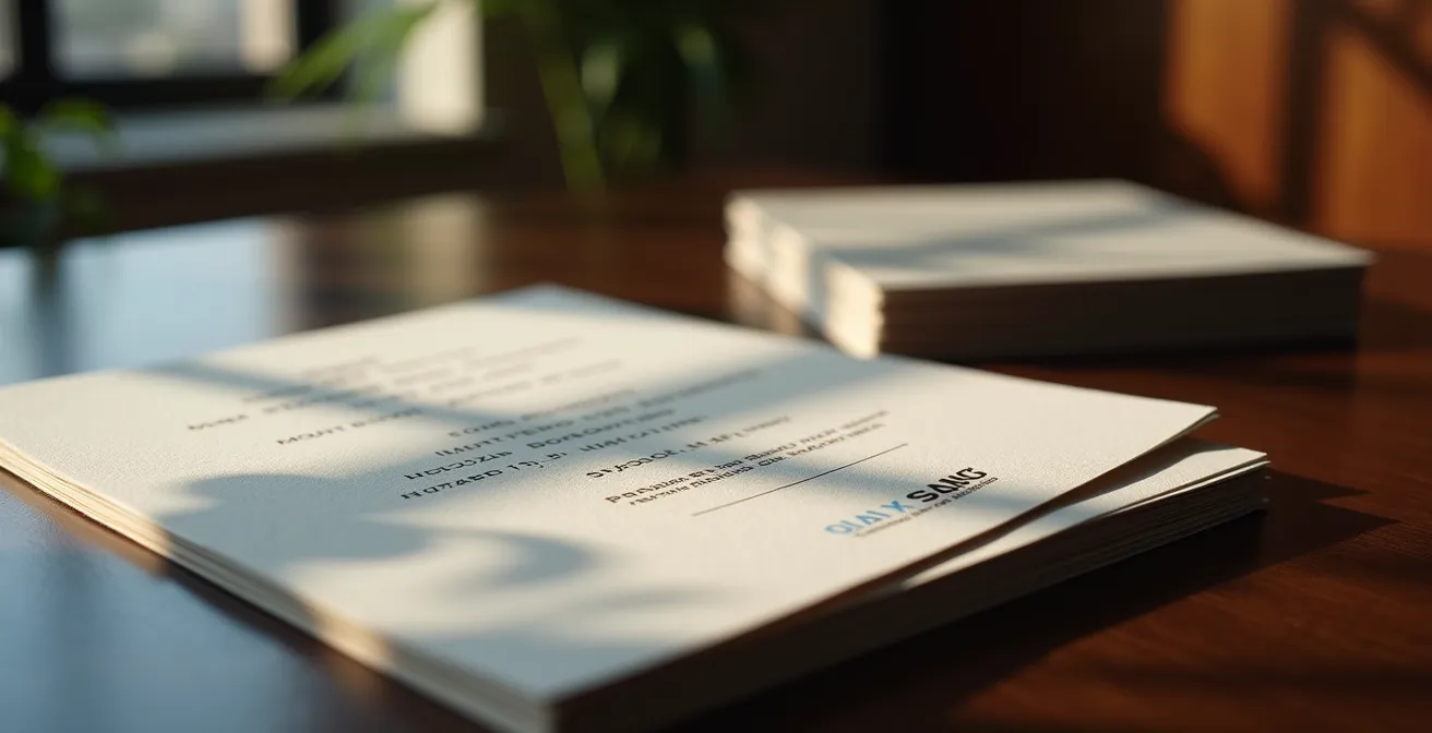
You have spent months, perhaps years, perfecting the design of your latest jewelry collection. Every curve, every alloy, every clasp has been designed to embody excellence. Yet, once the product is finalized, another challenge arises: how to pack, present, and communicate this value before the box is even opened? The temptation is great to focus on obvious elements like hot foil stamping or a prominent logo. We think visual; we think immediate recognition. But what if the first dialogue with your client was neither visual nor verbal, but purely tactile?
This is where a dimension often underestimated by young brands comes in: haptic communication. The simple act of picking up a business card, a product tag, or a thank-you note triggers a cascade of subconscious judgments. The weight, texture, and above all, the rigidity of your printed medium are not just material characteristics; they are the first syllables of your brand story. A 24-point (pt) cardstock is not just “thicker.” It represents a signal of permanence, a promise of quality that instinctively transfers from the packaging to the product it contains.
This article is not a simple paper catalog. It is a deep dive into the psychology of the luxury consumer, applied to the crucial choice of your communication materials. We will break down why the rigidity of cardstock speaks louder than a long speech, how technical details like edges, cutting, or creasing become vectors of emotion, and what critical errors can sabotage your brand perception, despite all your good intentions. For a high-end brand creator in Quebec, where luxury is often more discreet and authentic, mastering these non-verbal codes is not an option—it is a strategic imperative.
To navigate this universe where matter becomes message, we will address the technical and psychological aspects that transform a simple piece of cardboard into a powerful branding tool. This guide is structured to give you the keys to understanding and action, from the most fundamental concept to the sharpest finishing details.
Table of Contents: Perceiving Luxury Through the Prism of Cardstock: A Strategic Analysis
- Why is 18pt cardstock more rigid than 100lb cover paper?
- How to glue two different colored stocks for an impactful colored edge?
- Laser cutting or die-cutting: Which technique for clean edges on 32pt?
- The mistake of forgetting deep creasing on thick cardstock printed with dark solids
- When choosing a cardstock that is too heavy doubles your postage costs?
- How do high-end finishes influence the perception of your business documents?
- How to use spot UV to direct the eye toward your primary offer?
- Why pay for a 5th Pantone color on your corporate documents?
Why is 18pt cardstock more rigid than 100lb cover paper?
The first confusion for a brand creator often comes from printing jargon. Between points (pt), pounds (lb), and grams per square meter (gsm), it is easy to get lost. Yet, the distinction is fundamental to mastering the tactile perception of your brand. The key is understanding what each unit actually measures. The “point” (pt) is a direct measure of paper thickness: one point equals one-thousandth of an inch (0.001″). An 18pt cardstock therefore has a physical thickness of 0.018 inches. This measure is directly correlated to rigidity: the higher the number of points, the thicker and more rigid the cardstock feels.
Conversely, weight in “pounds” (lb) is more complex. It does not measure thickness, but the weight of a ream of 500 sheets at its uncut base size. A “100lb cover” paper can be denser but less thick than an 18pt cardstock. For the consumer, it is rigidity that communicates quality and durability, not density. A business card that does not bend under finger pressure sends a message of confidence and solidity. This is why printers specialized in high-end products highlight this characteristic. For example,24pt cardstock with Soft Touch lamination is often presented as the pinnacle of tactile luxury, precisely because its thickness guarantees uncompromising rigidity.
For you as a creator, this means you must dialogue with your printer by speaking in “points.” It is the most reliable indicator to guarantee the sensation of permanence you are looking for. Do not be impressed by a high “pound” weight; always ask for the equivalent in points or, better yet, physical samples to judge the hand-feel for yourself. It is this first contact that defines perceived value.
How to glue two different colored stocks for an impactful colored edge?
In the world of discreet luxury, subtlety is king. A detail that seems trivial can become a powerful brand signature. Colored edges are a perfect example. This technique, called duplexing (or mounting), consists of assembling two, three, or even more sheets of cardstock to create a support of exceptional thickness, while revealing one or more colors on the edge. It is no longer just a printing medium; it is an object in itself, a mini-artifact that intrigues and invites inspection.
The process is an art that requires absolute precision. The cardstocks, often in contrasting colors (a pure white duplexed onto a deep black, or a natural kraft onto a bright color from your graphic charter), are glued under high pressure to guarantee perfect and invisible adhesion. The result is a perfectly clean edge, a sliver of color that catches the light and the eye. For a jewelry brand, this can evoke the layering of a precious stone or the detail of a setting. It is a sophisticated way to integrate the brand’s color identity without overloading the printed surface.
Case Study: The Authentic Luxury of an Estrie Cabinetmaker
An art cabinetmaker from Estrie, Quebec, sought to communicate his artisanal craftsmanship and high-end positioning. Rather than opting for glossy finishes, he chose, in collaboration with an exceptional Quebec printer, packaging in kraft cardstock duplexed onto rigid black cardstock. A simple deep debossing of the logo on the kraft was enough. The contact with the raw texture of the kraft and the discovery of the sober black edge instantly evoked the duality of raw wood and worked metal, justifying a high price point and creating a memorable unboxing experience.
This choice is not just aesthetic; it is strategic. It positions the brand in a register of luxury craftsmanship and attention to detail—values particularly appreciated by a Quebec clientele sensitive to authenticity.
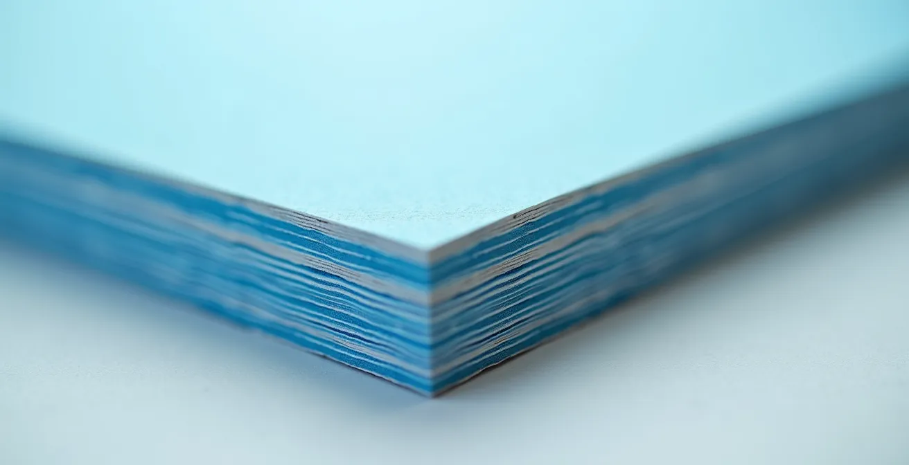
The thickness obtained through duplexing, easily reaching 32pt, 48pt, or more, also confers incomparable weight and rigidity. Holding such an object in hand is an experience in itself. The weight communicates substance; the colored edge reveals the care taken in manufacturing. It is the very definition of perceived value.
Laser cutting or die-cutting: Which technique for clean edges on 32pt?
Once you have an exceptionally thick cardstock, whether through duplexing or not, the way it is cut becomes a strategic choice. The edges of your business card or tag are just as important as its surface. Frayed or imprecise edges betray the promise of quality. Two main technologies are available: traditional die-cutting and modern laser cutting. Each sends a different message.
Die-cutting is the artisanal method. A custom cutting die, a sort of metal “punch,” is created specifically for your project. It then presses and slices through the cardstock with force. The result is a clean, raw, and authentic edge. It is a perfect technique for large runs because, once the die is created, the cost per unit decreases rapidly. It evokes tradition, solidity, and the expertise of classic printing.
Laser cutting, on the other hand, uses a high-intensity light beam to vaporize the material according to a digital path. Its precision is surgical, allowing for shapes of incredible complexity that are impossible to achieve with die-cutting. On thick cardstock, the edge will be perfectly clean and “sealed” by heat, with a very slight characteristic brownish tint. This technique is ideal for small runs, prototypes, or very intricate designs. It communicates modernity, innovation, and cutting-edge technology.
The choice between the two depends on the story you want to tell and the size of your production. The following table, based on the expertise of luxury printers, summarizes the key points to help you decide.
| Criterion | Laser Cutting | Die-Cutting |
|---|---|---|
| Precision | ±0.1mm | ±0.2mm |
| Edge Appearance | Slightly browned, sealed | Clean and raw |
| Initial Cost | Low (no tool) | High (die creation) |
| Profitable Volume | 1-500 units | 500+ units |
| Perceived Message | Modernity, technology | Tradition, authenticity |
Laser cutting allows for total flexibility for small series or prototypes, ideal for market testing at a controlled cost.
– Luxury Offset Printing Expert, Guide to Excellence in Printing in Quebec
The mistake of forgetting deep creasing on thick cardstock printed with dark solids
Here is one of the most common and devastating traps for a luxury brand: investing in a magnificent 24pt or 32pt cardstock, printing it with a deep black or an intense midnight blue, and then folding it. If the folding operation is not prepared by adequate creasing (scoring), the result is catastrophic. The ink surface cracks, revealing the white paper fibers underneath. This is the equivalent of a scratch on the bodywork of a new car. The entire perception of luxury and perfection collapses in an instant.
Creasing consists of creating a groove or furrow in the cardstock to guide the fold and prevent the fibers from breaking. On thin cardstock, a simple score is enough. But on thick cardstock (beyond 18pt), and especially with a heavy ink load (a dark solid), standard creasing is insufficient. Dried ink stiffens the paper surface, making it even more brittle. You must demand deep or double creasing from your printer, with a channel (the width of the furrow) specifically calibrated for the thickness of your cardstock.
This technical step is non-negotiable. It is the guarantee that your greeting cards, presentation folders, or product boxes will maintain their impeccable appearance, even after handling. A luxury brand cannot tolerate the slightest imperfection. Cracking at the fold is a signal of low-cost production that annihilates all other efforts invested. Before launching production, the discussion on the type of creasing is as crucial as the choice of paper.
To arm yourself for your discussions with suppliers, here are the essential questions to ask to guarantee a perfect result.
Your Action Plan: Critical Questions for Your Quebec Printer
- For a cardstock of this thickness (e.g., 24pt) with a dark solid, do you recommend simple, double, or a specific creasing technique?
- What is the creasing channel width you use to guarantee a clean fold without cracking?
- Does your process systematically include folding tests on samples before launching the full run?
- Can you provide me with physical examples of creasing you have performed on cardstocks of similar thickness and finish?
- What guarantee do you offer against the risk of cracking on the fold areas of the final production?
When choosing a cardstock that is too heavy doubles your postage costs?
The perceived weight of your communication materials is a major psychological asset. Heavy cardstock is synonymous with substance and value. However, this quest for weight can have a very concrete and costly side effect: an explosion in your postage costs. For a brand that sends thank-you cards, invitations, or small promotional mailings, this logistical aspect must be anticipated from the design phase.
In Canada, Canada Post rates are structured by very strict weight tiers. The standard rate for a letter, for example, covers a weight of up to 30 grams. If your mailing weighs 31 grams, you automatically jump to the next tier (30g to 50g), and the cost of the stamp increases significantly. Let’s take a concrete example: the 2024 postal rates indicate a rising cost for every excess gram. Switching from 24pt cardstock to 32pt cardstock might seem trivial, but it can be precisely what pushes you over a pricing threshold.
Imagine a standard size (C6) greeting card with its envelope. The total weight varies drastically depending on the chosen cardstock. A standard 14pt stock will keep the set well below 30g. A premium 24pt stock will flirt with this limit. But an ultra-luxury 32pt stock will almost certainly exceed it, driving up the cost of every mailing.
The table below illustrates the financial impact of this choice on a mailing of 1000 cards, based on Canada Post weight tiers.
| Cardstock Type | C6 Card Weight + Envelope | Unit Cost (approx.) | Cost for 1000 Units |
|---|---|---|---|
| 14pt standard | ~18g | $1.15 | $1,150 |
| 24pt premium | ~28g | $1.15 | $1,150 |
| 32pt ultra-luxury | ~38g | $1.94 | $1,940 |
| Difference 14pt vs 32pt | +20g | +$0.79 | +$790 |
The decision to use a heavier cardstock must therefore be a conscious trade-off between the desired psychological impact and the actual logistical cost. For a very exclusive mailing to a few dozen VIP clients, the extra cost is negligible. For a larger campaign, it must be budgeted from the start. The solution may be to reserve the heaviest cardstock for hand-deliveries and opt for a 24pt, just under the limit, for postal mailings.
How do high-end finishes influence the perception of your business documents?
In a market as specific as Quebec, the notion of luxury is often interpreted differently than in the rest of the world. Studies show a preference for discreet and authentic luxury, far from ostentation and “bling-bling.” According to a market analysis published in La Presse, Quebec is distinguished by a scarcity of traditional luxury boutiques, which reinforces the importance for local brands to adopt an approach that resonates with a culture valuing substance over appearance.
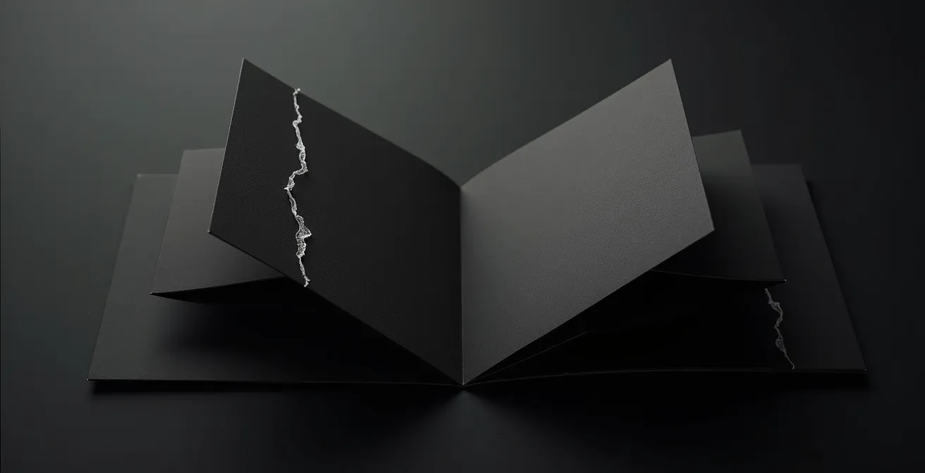
For your printed materials, this translates into a strategic choice of finishes. Rather than relying on a shiny gold foil that screams “luxury,” the winning Quebec approach favors finishes that engage touch and curiosity. Debossing (or letterpress) is the perfect example. This technique involves pressing a plate into the paper to create a depression, a tactile relief. When performed “dry,” meaning without ink, it is called blind debossing. The logo or pattern is not seen; it is first felt.
This finish has redoubtable psychological power. It forces the recipient to slow down, to run their finger over the relief, to interact with the object. It is an invitation to discovery, a whispered secret rather than a shouted slogan. For a jewelry brand, debossing a fine pattern on thick cardstock evokes the work of the engraver, the artisan’s footprint. It communicates effort, care, and timelessness. Furthermore, this technique carries values of authenticity and environmental respect, as it adds no chemical substances to a paper often chosen for its natural quality.
Other finishes like embossing (which creates a relief upwards) or foil stamping (application of a metallic leaf by pressure) should be used with the same moderation. The goal is not to accumulate effects, but to choose THE finish that best tells your brand story and aligns with this culture of subtle and confident luxury.
How to use spot UV to direct the eye toward your primary offer?
Spot UV is a finish that consists of applying a layer of glossy varnish only to specific areas of a printed material, creating a striking contrast with the surrounding matte surface. Too often used as a simple decorative element, its true power lies in its ability to function as a psychological guidance tool. It allows for the creation of a hierarchy that is not only visual but also tactile, directing your client’s attention exactly where you want it.
The human brain is programmed to notice anomalies and contrasts. This is the salience bias. On a business card with a matte “soft touch” finish, a glossy area stands out instantly. The eye is drawn to it, then the hand follows, curious to understand this difference in texture. You can exploit this mechanism to highlight the most critical elements of your communication:
- Your logo: Making it glossy on a matte background brings it to life and reinforces its memorability.
- Your call to action: A website or a phone number in spot UV becomes the focal point of the card.
- A product detail: For a fashion brand, the varnish can emphasize the texture of a fabric in a photo.
The most effective strategy is to use it sparingly. Flooding a card with varnish causes it to lose all its impact. The idea is to establish a tactile hierarchy: the varnish for identity or action, the matte for the background and secondary information. On dark backgrounds (black, navy blue, forest green), the effect is particularly spectacular, as the varnish captures the light and creates dynamic reflections that change according to the viewing angle, sometimes revealing hidden patterns or messages. It is a subtle play with light that adds a layer of interactivity and sophistication to your material.
Key Takeaways
- Psychological Signal: Cardstock thickness and weight are not neutral; they activate cognitive biases associating physical substance with brand value and trust.
- Quebec Context: The luxury market in Quebec values authenticity and discretion. Tactile finishes (duplexing, debossing) are often more impactful than ostentatious gilding.
- Strategic Trade-off: Technical details such as the type of cut, creasing quality, and final weight for postage are strategic decisions that affect both brand perception and the overall budget.
Beyond Pantone: Why consistency is the true pillar of trust?
Paying for a fifth color, often a Pantone color, may seem like a superfluous luxury in the era of high-quality CMYK (Cyan, Magenta, Yellow, Black) digital printing. However, for a luxury brand, color is not a simple aesthetic attribute; it is a pillar of its identity. “Tiffany Blue,” “Valentino Red,” or “Hermès Orange” are not vague shades. They are precise, protected, and instantly recognizable chromatic signatures. Guaranteeing their perfect reproduction across all media, from the website to the business card to the boutique bag, is a matter of absolute consistency.
The CMYK system, while efficient, has its limits. It cannot reproduce all the colors visible to the human eye, notably very bright, saturated hues, very specific pastels, or metallic tones. A Pantone color is a pre-mixed ink according to an exact formula, guaranteeing that the color will be identical whether your card is printed in Sherbrooke, your packaging in Laval, or your catalog in Montreal. It is insurance against variability. Some Quebec printers go even further by using hexachrome (CMYK + Orange + Green) to expand the color space and get as close as possible to these impossible hues.
Investing in a Pantone color sends a clear message: “We leave nothing to chance.” This obsession with detail transfers directly to the perception of your products. If a brand is this rigorous about the color of its paper, the customer deduces it is equally so for the quality of its diamonds or the finish of its seams. It is a signal of professionalism and longevity. As highlighted by the consultancy McKinsey, luxury brands maintain their appeal by creating exclusive experiences. Color perfection is an integral part of this exclusivity.
Ultimately, the 5th color is not a cost; it is an investment in trust. It is the guarantee that the story you tell is the same, everywhere, all the time. In a world saturated with images, owning a color and defending it with flawless consistency is one of a luxury brand’s most powerful assets.
For a high-end brand creator, every material decision is a statement. The choice of 24pt cardstock, subtle duplexing, or a precise Pantone color is not an expense but an active component of your brand strategy. These choices build a coherent sensory experience that justifies your positioning and creates a lasting bond of trust with your clientele. The next step is to audit your own materials with this new sensory and strategic grid to guarantee that every touchpoint tells the right story.