Spot UV varnish is not just an embellishment; it is a neuromarketing weapon designed to control your customers’ attention.
- The contrast between a matte surface and a glossy area creates a “cognitive clash” that forces the brain to memorize the highlighted element (logo, offer).
- Relief and texture trigger a “haptic hook”: the desire to touch engages the customer much more deeply than simple reading.
Recommendation: Before choosing a finish, define the specific emotion or action you want to trigger. Think first about your customer’s brain, then about the design.
As a marketer, you know that feeling of frustration: expensive brochures that end up in the trash, elegant business cards that are instantly forgotten. In a world saturated with information, capturing attention has become the major challenge. Many believe the solution lies in bolder designs or punchier messages. They then turn to print finishes, like spot UV varnish, with the misconception that they simply serve to “look pretty” or provide a “premium” feel. This is a limited vision that misses the point.
What if the true power of spot UV varnish wasn’t a matter of aesthetics, but of neuroscience? What if it were a strategic tool to create a perceptive hierarchy, a way to “hack” the brain’s attentional system to force it to see what YOU want it to see first? This technique transforms a simple printed piece into a controlled sensory experience, where touch and light become your best allies in guiding the gaze directly toward your value proposition, your logo, or your call to action. The goal is no longer just to please, but to direct.
This article goes beyond the usual technical advice. We will decode the psychological mechanisms behind each type of finish. You will discover how iconic Quebec brands use these levers to subtly manipulate perception, transform a simple contact into a memorable experience, and ultimately, increase the performance of their communication tools.
Table of Contents: The Guide to Spot UV Varnish as a Neuromarketing Tool
- How does varnish on black create a subtle and elegant background texture?
- Spot UV varnish: how to make water or glass shine on your food photography?
- Why is the “Soft-touch matte + Glossy varnish” contrast the winning duo for luxury?
- The mistake of putting varnish on text that is too fine and becomes unreadable at the slightest shift
- When to choose raised varnish to add a tactile dimension to your logo?
- Why does 24pt cardstock radically change the perception of your luxury brand?
- How do high-end finishes influence the perception of your business documents?
- Why pay for a 5th Pantone color on your corporate documents?
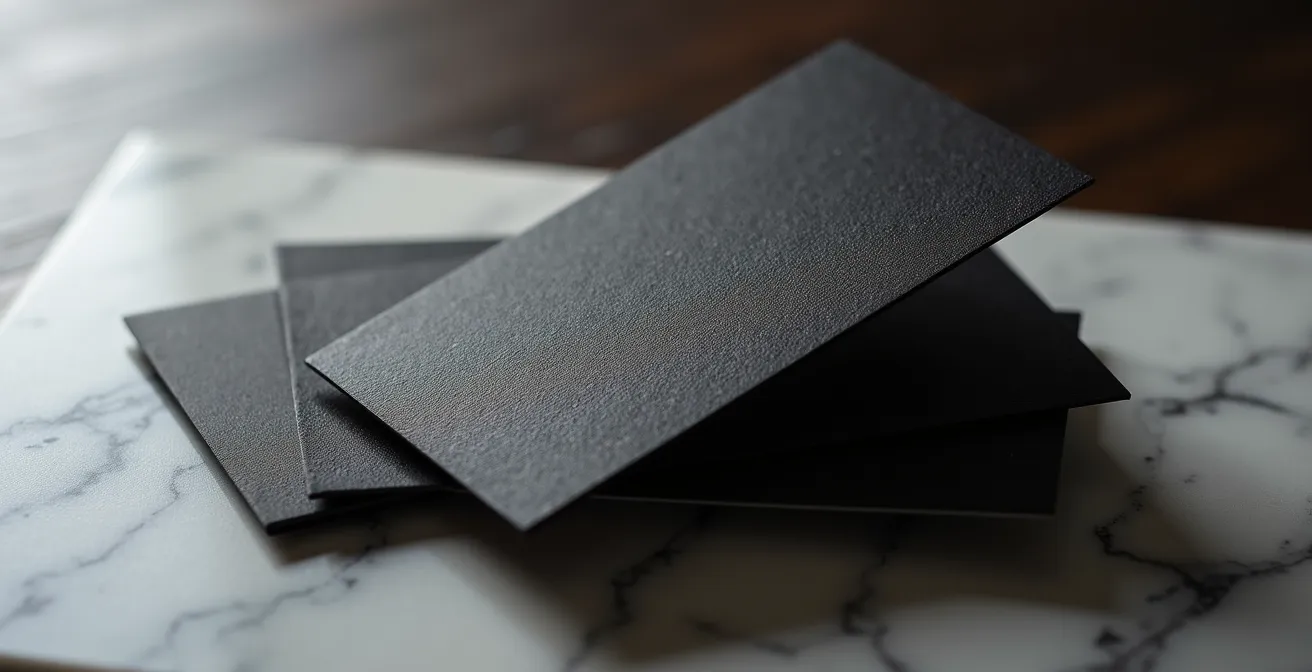
How does varnish on black create a subtle and elegant background texture?
Black is the ultimate backdrop for luxury and sophistication. However, a solid black area can look flat, even boring. Spot UV varnish on a black background acts as a revealer. Its secret lies not in what it shows, but in how it plays with light. While matte paper absorbs light, the varnish reflects it. This micro-contrast, often perceived subliminally, creates a visual vibration that intrigues the brain. The eye is drawn not by a color, but by a difference in material—a texture that suggests depth and complexity.
This technique allows for the creation of tone-on-tone patterns that only appear at a certain angle. It is the embodiment of discreet luxury: the information is not imposed; it is discovered. This transforms a simple document into an interactive object, inviting the recipient to manipulate it to reveal its secrets. It is a powerful signal of refinement that communicates quality without needing words. In Quebec, the commercial printing market is robust, with 1,294 establishments generating $2 billion in revenue, offering wide access to these cutting-edge technologies.
The Opéra de Montréal, for example, has mastered this art. For its programs, using spot UV varnish to highlight the brand is not just an aesthetic choice. It creates a key design that becomes a sensory signature, perfectly embodying the prestige and discreet luxury so dear to Quebec culture. The document is no longer just a program, but the first act of the spectator’s experience.
Spot UV varnish: how to make water or glass shine on your food photography?
In food marketing, the objective is to trigger a visceral reaction: hunger, thirst, desire. Spot UV varnish is a formidable neuromarketing technique to achieve this. Applied to a photo of an icy glass or a bottle pearling with condensation, it doesn’t just imitate shine. It activates what scientists call mirror neurons. By seeing a hyper-realistic representation of freshness, our brain simulates the sensation, creating an almost instantaneous craving.
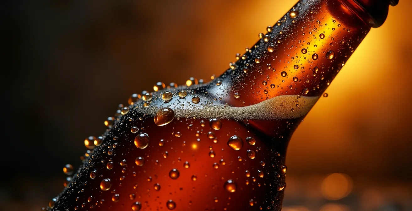
As shown in this image, the varnish isolates the water droplets from the rest of the image, giving them a volume and brilliance that printing alone cannot reach. It is an attentional hack: your eye is instinctively drawn to these points of light, momentarily ignoring the rest of the visual. This is particularly effective in the context of Quebec microbreweries and cider houses. Many ice cider producers, for instance, use spot or 3D varnish to make water droplets stand out on their labels, simulating the frost and intense freshness of the product. The product becomes irresistible even before the first sip.
The choice of varnish depends on the desired effect. For a simple reflection on a wine glass or to accentuate the shine of a glaze on a dessert, classic spot UV varnish is ideal. To give volume to water drops or champagne bubbles, 3D raised varnish will provide an additional tactile dimension.
This comparative table will help you choose the most suitable finish for your food product visuals.
| Varnish Type | Ideal Application | Visual Effect | Relative Cost |
|---|---|---|---|
| Spot UV Varnish | Drops, liquid reflections | Highlights a specific area, very elegant look that catches the eye | Medium |
| 3D Raised Varnish | Frost texture, bubbles | Pronounced tactile volume | High |
| Flood UV Varnish | General protection | Applied over the entire surface for a high-quality finish | Low |
Why is the “Soft-touch matte + Glossy varnish” contrast the winning duo for luxury?
The pinnacle of the sensory experience in printing lies not in a single finish, but in the tension between two opposing textures. Combining a “soft-touch” matte lamination (peach skin feel) with a glossy spot UV varnish is the most powerful technique for creating cognitive contrast. When a person holds a card or brochure with this finish, their brain receives two contradictory tactile signals: the velvety softness of the background and the smooth, cold surface of the varnish. This sensory “surprise” creates a spike in attention and anchors the object in the memory.
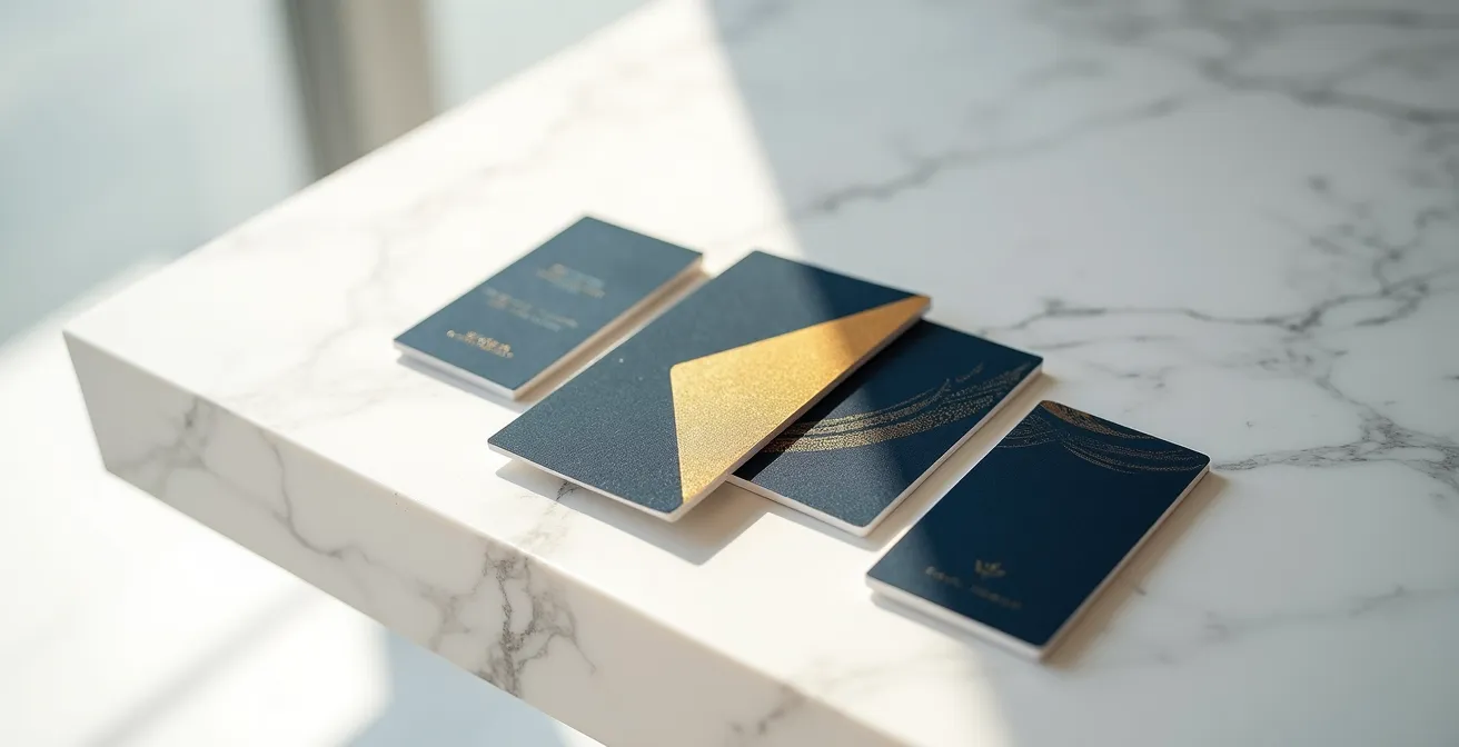
This is a strategy widely used by luxury real estate developers in Quebec, from Griffintown to Tremblant. Their brochures combine spot UV varnish on paper with matte lamination. This combination is no accident: it evokes the quality of construction materials (the velvetiness of raw concrete against the shine of floor-to-ceiling windows). This creates a memorable unboxing experience that significantly increases document retention rates. The prospect doesn’t throw the brochure away; they keep it as an object of value.
This technique is particularly effective because it caters to companies that want to highlight an element at a reasonable cost, with a discreet yet prestigious touch. The logo, a title, or a key image stands out not only visually but also physically. It is the assurance that the most important element of your message will not only be seen but also felt and remembered.
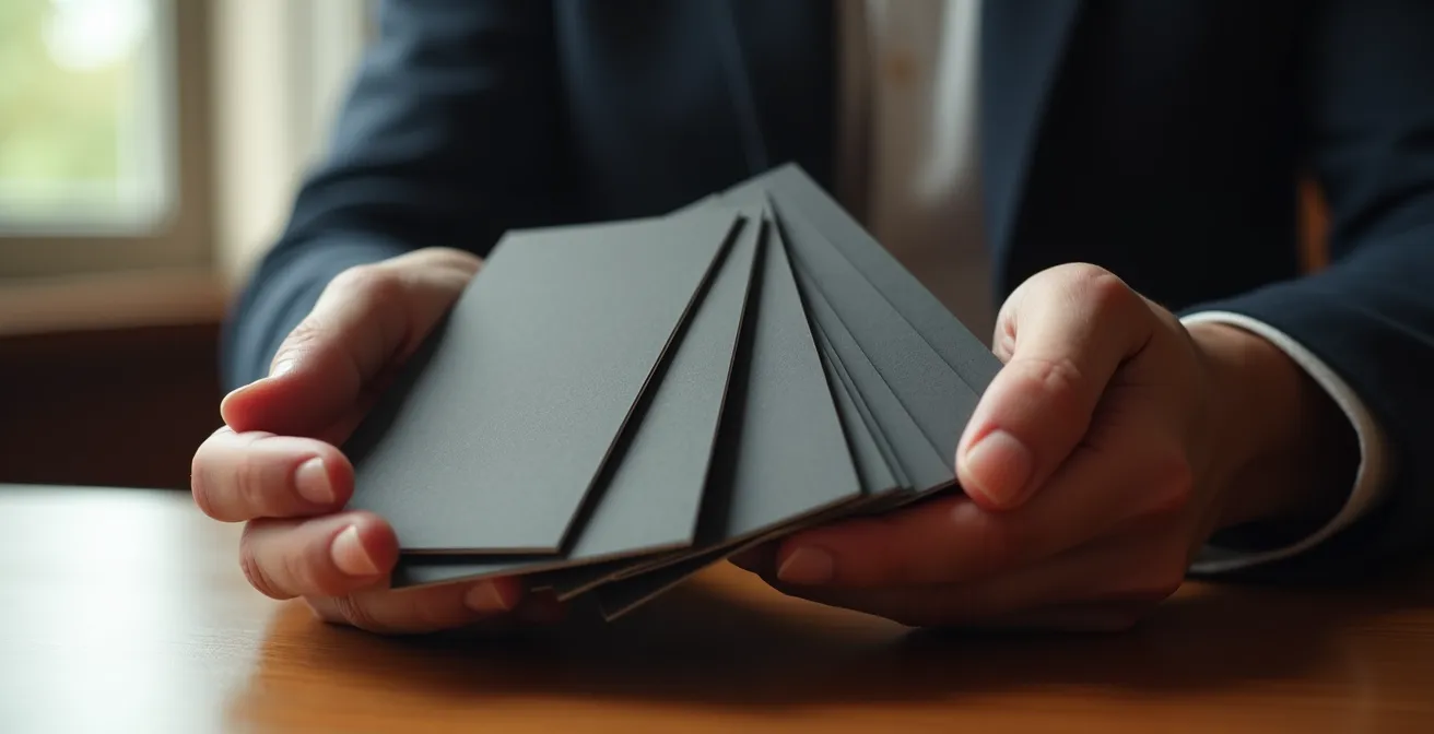
The mistake of putting varnish on text that is too fine and becomes unreadable at the slightest shift
Enthusiasm for spot UV varnish can quickly turn into a disaster if one ignores a fundamental technical constraint: registration. Registration is the perfect alignment of the different print layers (colors, varnish). Even with the most modern machines, there is always a margin of tolerance, a potential shift of a few fractions of a millimeter. On a large logo or image, this shift is invisible. But on fine text or small characters, it becomes catastrophic.
The classic error is wanting to make a slogan or contact details shine with varnish. If the text has a font size smaller than 7 or 8 points, the slightest shift (known as “misregistration”) will make the text blurry, doubled, and therefore totally unreadable. The desired “premium” effect turns into an amateurish result that devalues your brand. The varnish, instead of highlighting the information, destroys it. It is therefore imperative to reserve spot UV varnish for sufficiently large graphic areas: logos, icons, textured backgrounds, or titles with thick typography.
To avoid this costly mistake, communication with your Quebec printer is crucial. Don’t just send a file; engage in a technical discussion to ensure your design is compatible with their production constraints. Here are the essential points to validate before launching any spot UV printing.
Your anti-smudge checklist: points to validate with your printer
- Tolerance and minimum point size: What is your exact registration tolerance? Confirm that you are not applying varnish to text smaller than 7 points.
- Stroke weight: Does the design use fine lines? Ensure they have a minimum thickness of 0.5 points so the varnish can adhere correctly.
- Safety margin: Does the file include “trapping”? Ask the printer if a slight overlap of the varnish is needed (a 0.25 pt outline, for example) to compensate for micro-shifts.
- Fold zone: If the document is folded (flyer, brochure), is a 2 to 3 mm varnish-free margin provided at the fold location to prevent the varnish from cracking?
- Validation by example: Can you show me samples of similar work you have done, particularly with fine details, so I can judge the actual result?
When to choose raised varnish to add a tactile dimension to your logo?
While classic spot UV varnish plays with light, raised (or 3D) varnish plays with a much more intimate dimension: touch. This technique deposits a much thicker layer of varnish, creating a palpable dome that resembles a water drop. Its main objective is to create a “haptic hook.” This is the art of using texture to stop the thumb scanning a surface and invite tactile exploration. Physical contact with the logo or icon creates a stronger neurological link and increased memorization.
Choosing raised varnish is strategic and should be reserved for elements that embody the essence of your brand. The logo is the ideal candidate. Making it tactile makes it more real, more substantial. This is particularly relevant for technology brands (evoking a button interface), luxury brands (suggesting jewelry), or services that want to communicate a sense of “tangibility.” It is a great tool for business cards distributed at major networking events in Quebec, such as C2 Montréal, where standing out is vital.
In more innovative ways, Quebec organizations use it in an inclusive approach. By applying 3D UV varnish to add relief to icons, they create a near-Braille effect. This makes key information or logos recognizable by touch for visually impaired people, a use that aligns the brand with strong values of accessibility. Raised varnish is just one of the options for creating volume, as shown in this table.
| Technique | Characteristic | Recommended Usage | Relative Price |
|---|---|---|---|
| 3D Raised Varnish | Spot UV varnish with or without lamination | Modern logos, tech | Medium-High |
| Embossing | Allows paper to feature raised print patterns | Traditional prestige | High |
| Debossing | Indentation in the paper | Artisanal luxury | Very High |
Why does 24pt cardstock radically change the perception of your luxury brand?
Even before the first visual contact, there is the first physical contact. The weight and thickness of a printed medium are the first signals of quality that your customer perceives. In the psychology of perception, this is a known concept: our brain unconsciously associates weight and substance with value and durability. A thin, flexible business card (14pt or 16pt) bends easily and evokes the ephemeral. A thick, rigid card (24pt and up) resists, has “stature,” and communicates permanence, trust, and investment.
Choosing a 24pt, 32pt, or even thicker cardstock is not mere vanity; it is a positioning statement. You signal to your interlocutor that you do not compromise on quality, neither on your materials nor on your services. This is a particularly powerful message for sectors where trust is paramount: finance, law, luxury real estate, strategic consulting. Handing over a thick card is like offering a firm and confident handshake. The weight of the document physically anchors your brand in your prospect’s hand.
This visual progression of thickness is directly correlated to the perception of value. A thicker medium justifies not only a higher service price but also increases its own retention rate. People hesitate to throw away an object that feels so substantial. It is a minimal investment considering the psychological impact it generates. Thickness is not a detail; it is the foundation of the first impression.
How do high-end finishes influence the perception of your business documents?
High-end finishes like hot foil stamping, embossing, or raised varnish function as a “cost signal.” In behavioral economics, a cost signal is an action that, because it is expensive, credibly demonstrates the commitment and quality of the person emitting it. By investing in complex and costly finishes for your business documents, you send a powerful non-verbal message: “We are a serious, prosperous company, confident enough in our value to invest in our own image.”
This investment directly influences how your proposals and quotes are perceived. A superior quality document creates a “halo effect.” Even before reading the content of your offer, the recipient is positively predisposed by the quality of the object they are holding. The perception of the quality of the container transfers to the perception of the quality of the content. This cognitive bias is an extremely effective marketing lever, especially in competitive bidding processes.
Case Study: Montreal Architectural Firms
Facing fierce competition for municipal contracts, several Quebec architectural firms began submitting their proposals on documents using raised varnish covering up to 75% of the front to illustrate plans and renderings. The result is a document that offers a look that is both professional and creative. Internal analysis showed that the halo effect generated by the document’s quality led to a nearly 15% increase in the acceptance rate of their proposals, with the presentation positively influencing the perception of the project even before it was read in detail.
The choice of finish must, however, be aligned with the sector’s identity. A tech startup will benefit more from the innovative look of 3D varnish, while a notary’s office will reinforce its image of tradition and prestige with classic hot foil stamping.
| Sector | Preferred Finish | Strategic Objective | 2024 Trend |
|---|---|---|---|
| Legal (Notaries, Lawyers) | Hot Foil Stamping | Traditional Prestige | Focus on durability |
| Tech & Design | 3D Raised Varnish | Visual Innovation | Strong growth |
| Hospitality & Spas | Full Soft-touch | Sensory Experience | Stable Premium |
Key Takeaways
- Varnish is not a decoration, but a visual guidance tool to direct the customer’s attention toward the strategic elements of your message.
- Tactile contrast (soft matte against smooth gloss) creates a “sensory surprise” that anchors your logo or offer in the customer’s memory.
- Paper thickness and color precision (Pantone) are direct investments in the perception of your brand’s value and credibility.
Why pay for a 5th Pantone color on your corporate documents?
In the digital age, color is often considered a mere hexadecimal value. But in the physical world of printing, color is heritage. Four-color printing (CMYK) is a mixing process that attempts to recreate a color by overlapping dots of cyan, magenta, yellow, and black. It is an approximation. The Pantone system, however, is a system of pre-mixed inks that guarantees a color that is absolutely identical and consistent, print after print, medium after medium. Paying for a 5th Pantone color is not a luxury; it is insurance.
It is the assurance that your logo’s blue will be exactly the same on your business card, your brochure, your exhibition booth, and your packaging. This consistency is the foundation of brand recognition. Major Quebec brands understand this well. The blue of the Quebec government, the green of Desjardins, the red of National Bank, or the orange of Jean Coutu are not just colors; they are brand assets worth millions. Studies show that the difference in perception between an approximate CMYK color and the true Pantone can lead to a reduction in brand recognition of up to 25%. The investment is therefore widely justified.
Using a Pantone also signals a level of professionalism and attention to detail that reassures customers and partners. It shows that you leave nothing to chance. Investing in a Pantone color becomes profitable when the color is a central element of your identity and you produce a sufficient volume of documents for consistency to become a strategic issue.
To move from theory to practice, the next step is to audit your current communication materials. Identify the most relevant opportunity to integrate a haptic hook or a cognitive contrast in your next campaign, in order to transform a simple print into a powerful tool of persuasion.