Your storefront is not just an advertisement; it is a sales engineering tool that must actively counter pedestrian indifference and adapt to harsh Quebec constraints.
- The choice of material (lettering, full wrap, perforated) must be a strategic decision based on light management and privacy, not just an aesthetic choice.
- Climate resilience is non-negotiable: ignoring the impact of cold on installation and ink wear is a costly mistake that destroys your investment.
- Visual consistency, from product packaging to the storefront, creates instant recognition that transcends language barriers and Bill 96 constraints.
Recommendation: Stop thinking of your storefront as a surface to decorate. Design it as a complete conversion system, from the sidewalk to the counter, where every visual element is tasked with guiding the customer toward a purchase.
You have a brick-and-mortar presence, perhaps on a bustling artery like Mont-Royal Avenue in Montreal or Saint-Jean Street in Quebec City. Thousands of passersby stream past your business every day. Yet, the door remains desperately closed. You feel invisible, a mere element of the urban landscape. This frustration is the daily reality for many merchants who, despite a prime location, struggle to convert foot traffic into qualified store visits.
Faced with this challenge, the usual advice pours in: “use bright colors,” “decorate for the holidays,” “be original.” These recommendations, while well-intentioned, remain superficial. They treat the storefront like a canvas to paint, forgetting that it is primarily a strategic interface between the street and your sales floor. True performance does not lie in simple aesthetics, but in a deeper approach—true storefront engineering. It must not only grab attention but also manage light, privacy, extreme Quebec climate conditions, and even linguistic legislation.
What if the key wasn’t to shout louder than the others, but to create a visual journey so coherent and relevant that it transforms a passerby’s indifference into active curiosity, and then into an intent to purchase? This is the perspective we will explore. This article is not a product catalog, but a strategic guide for you, the merchant. We will analyze how to choose the right graphic tools, why the technicality of installation and materials is crucial in our climate, and how to build visual sovereignty that brings customers inside.
This article will guide you through strategic decisions and technical pitfalls to make your storefront much more than a facade: the primary salesperson of your business. Explore the different facets of graphic wrapping with us to build a winning strategy.
Summary: Mastering the Art of the Commercial Storefront to Convert Passersby
- Lettering or full print: which style attracts the most without blocking light?
- How to see out without being seen from the sidewalk using perforated vinyl?
- Why do non-slip floor decals guide the customer all the way to the counter?
- The mistake of installing exterior stickers at -10°C (and why they won’t stick)
- When to use “A-Frame” signs (sandwich boards) on the sidewalk to divert traffic?
- What font size should you use for a banner to be legible at 50 meters on the highway?
- Why are UV inks indispensable for all outdoor signage in Quebec?
- How to use your packaging colors and shapes to trigger a purchase in 3 seconds?
Lettering or full print: which style attracts the most without blocking light?
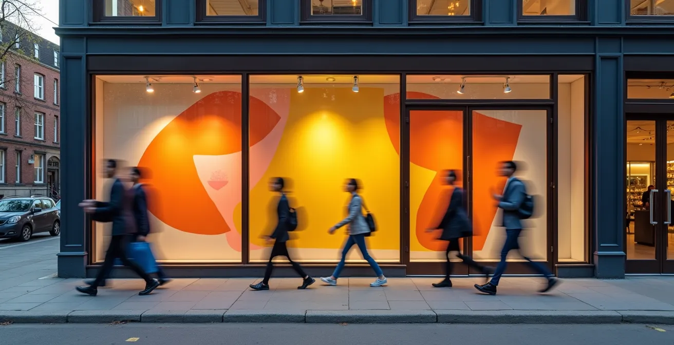
The first dilemma for any merchant is choosing between cut lettering, which preserves transparency, and full-surface printing, which maximizes visual impact but can darken the interior. There is no right or wrong answer, only an answer adapted to your commercial strategy. Lettering is ideal for a retail boutique that wants to showcase its products and create an open, welcoming atmosphere. Conversely, a spa, restaurant, or professional office will prefer full (or frosted) printing to create an atmosphere of privacy and exclusivity.
Light management is a crucial factor in Quebec, where winter days are short. A wrap that is too opaque can make your business look dark and uninviting. Cut lettering allows you to play with natural light, creating shadows that bring your space to life. Full printing, if well-designed, can use light to back-light a powerful visual, transforming your storefront into a true light box. The decision depends on the experience you want to offer from the sidewalk.
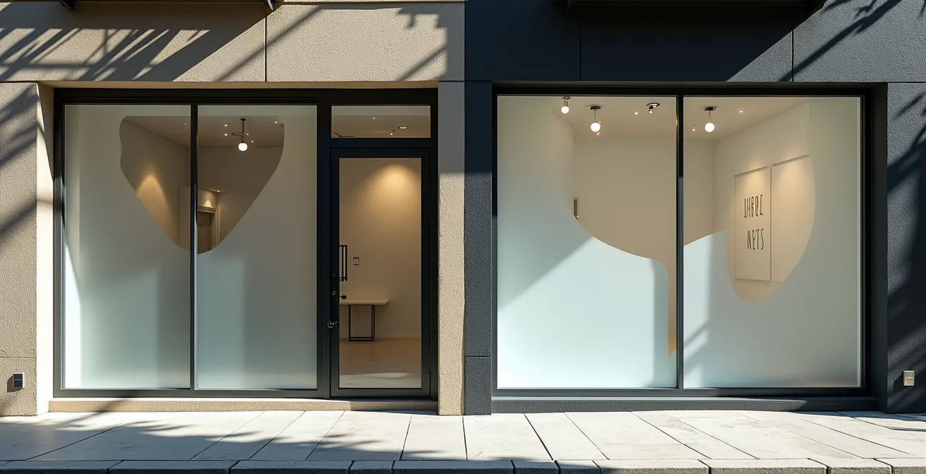
As this comparison shows, the choice radically influences perception. The storefront on the left, with its minimalist lettering, invites the eye to dive inside, while the one on the right creates a visual barrier that sparks curiosity about what is happening behind it. To make an informed choice, you must analyze your specific needs, the orientation of your facade, and even local legal constraints.
Your Practical Roadmap: Choosing Between Lettering and Full Print
- Evaluate your storefront’s orientation: A north-facing window receives less direct light; airy lettering is often preferable. A southern orientation may require partial printing to reduce glare and heat in the summer.
- Analyze your business type: A spa or confidential service will benefit from the privacy of a full print. A fashion boutique or café will benefit from the transparency offered by lettering to attract with its products or ambiance.
- Calculate the coverage ratio: Aim for a maximum of 40% coverage for a retail storefront to maintain optimal interior brightness, especially during Quebec winter months.
- Check Bill 96 compliance: If you use full printing with text, remember that French must be markedly predominant. Plan the necessary space during the design phase, as this can impact the balance of your visual.
- Choose the right vinyl: Monomeric vinyl is an economical option for 3 to 5 years, but polymeric vinyl (more expensive) offers better durability of 5 to 7 years, an important factor given our temperature fluctuations.
How to see out without being seen from the sidewalk using perforated vinyl?
Micro-perforated vinyl is a near-magical solution that meets a paradoxical need: allowing those inside to see out while presenting a full, opaque image to passersby. The secret lies in a simple optical principle. The material is made of small holes. During the day, the more intense exterior light reflects off the printed surface, making the visual dominant for the passerby. From the inside, where light is dimmer, the human eye primarily perceives the light passing through the perforations, providing a near-normal view of the outside.
This technology is particularly useful for businesses that want to run large-format promotions without plunging their employees and customers into darkness. This is the case for travel agencies, fitness centers, or restaurants that want to keep a view of the street. However, there is a catch: the effect reverses at night. When your business is lit up and it is dark outside, passersby will see perfectly inside, while you will only see a reflection of your own lighting.
Managing this “night inversion effect” is crucial. Exterior lighting directed at a 45-degree angle onto the window can help maintain the visual’s opacity in the evening. Additionally, maintaining perforated vinyl in Quebec requires special attention, especially in winter. Salt, calcium, and snow can clog the perforations and cancel out the vision effect. Regular cleaning is therefore essential to maintain the product’s effectiveness. Here are some tips for its maintenance:
- Clean the perforations every 15 days in winter with a soft brush to dislodge salt and ice.
- Use lukewarm water, never hot, to avoid thermal shock that could damage frozen vinyl.
- Consider applying a water-repellent treatment before winter to limit ice buildup.
- Given the weather conditions, plan a budget to replace it every 3 to 5 years.
Why do non-slip floor decals guide the customer all the way to the counter?
The customer experience does not end at the doorstep. In a context where online competition is fierce, forcing physical stores to reinvent themselves, every detail counts. In Quebec, while online sales now represent 6.0% of total retail trade, transforming a passerby into a buyer requires more than a beautiful storefront. This is where customer journey wayfinding via floor decals comes in. These are not just decorations; they are a subtle but powerful psychological guidance tool.
By creating a visual path on the floor, you take the customer by the hand from the moment they enter. This path can naturally lead them toward promotional zones, new arrivals, or directly to the checkout counter. Informal studies conducted by industry specialists show that businesses using directional floor marking observe an increase in time spent in-store and better circulation throughout the sales space. It is an effective way to combat your shop’s “cold zones.”
The relevance of this strategy is magnified in Quebec thanks to two factors. First, UL 410 certification guarantees that these adhesives are non-slip even in our winter conditions, when customers enter with snow or slush under their boots. Safety is ensured. Second, floor marking can become a powerful vehicle for promoting local products. Imagine a path guiding customers to a clearly identified “Aliments du Québec” section, thereby strengthening your positioning and meeting a growing demand for local trade. Integrating QR codes into the marking can even enrich the experience by linking the physical to the digital—for example, by linking to the story of a producer.
The mistake of installing exterior stickers at -10°C (and why they won’t stick)
It is a classic Quebec winter scene: a merchant, wanting to take advantage of a last-minute promotion, attempts to install a new storefront wrap in the middle of January. The result is almost always the same: the adhesive does not stick, peels off within hours, or forms unsightly bubbles. The mistake is not the product, but the failure to respect a fundamental physical principle: most permanent vinyl adhesives require a minimum surface temperature, generally around 10°C, so the glue can polymerize correctly and create a durable bond with the glass.
At -10°C, two phenomena combine to guarantee failure. On one hand, the adhesive becomes rigid and brittle, losing all flexibility. On the other hand, the surface of the glass, even if it looks clean, is covered with a thin invisible layer of frozen condensation. Attempting to apply the sticker is like trying to stick a label onto a block of ice. Adhesion is non-existent or, at best, superficial and temporary. The first freeze-thaw cycle will be enough to destroy what little adhesion was achieved.

Faced with this unavoidable climate constraint, planning is your best ally. The installation of permanent adhesives should be carried out during milder seasons. For winter promotions, you must turn to alternative solutions that do not depend on exterior temperature.
| Solution Type | Installation Temp | Durability | Relative Cost | Ideal Application |
|---|---|---|---|---|
| Permanent Vinyl Adhesive | Min. 10°C | 3-7 years | $$$ | Spring/Summer installation |
| Static Cling | Any interior temp | 3-6 months | $ | Winter promotions |
| Hanging Interior Poster | N/A | Variable | $ | Temporary winter messages |
| Removable Panel | N/A | Permanent | $$ | All seasons |
When to use “A-Frame” signs (sandwich boards) on the sidewalk to divert traffic?
The “A-Frame” sign, or sidewalk sandwich board, is the street merchant’s tactical weapon. While the storefront captures the gaze, the sandwich board has a more aggressive mission: intercepting and diverting the flow of passersby. Placed perpendicular to the facade, it enters the pedestrians’ field of vision and forces them to make a micro-decision: read it or ignore it. It is your first line of attack to break the monotony of city walking.
Its use is particularly wise in several scenarios. If your business is slightly set back from the alignment of other facades, the sandwich board acts as an extension of your presence on the sidewalk. If your entrance is narrow or barely visible, it becomes a powerful signal shouting “I am here!”. Finally, it is the perfect tool for communicating dynamic, time-limited offers that do not justify a complete storefront change: the daily special, a flash sale, or a “happy hour.”
However, its deployment is not a trivial act. It is governed by strict municipal regulations aimed at ensuring sidewalk accessibility. In Quebec, most regulations require leaving a minimum clearance of 1.5 meters to allow for the easy circulation of pedestrians, strollers, and wheelchairs. Ignoring this rule can lead to fines and harm your image as a good corporate citizen. The power of the sandwich board lies in its ability to be updated daily. Here are some content strategies to maximize its impact:
- Morning (8am-11am): Display welcome messages, a promotion on morning coffee, or pastries.
- Noon (11am-2pm): Highlight your daily menu, lunch special, or a weekly deal.
- Afternoon (2pm-5pm): Announce a “happy hour” discount or a late-day promotion to clear out unsold stock.
- Weekend: Offer more engaging messages, such as a funny question, a small game, or a special offer for families.
- Local Events: Adapt your message to festivals, street markets, or any other activity in your neighborhood to show your local roots.
What font size should you use for a banner to be legible at 50 meters on the highway?
Moving from designing a storefront for pedestrians to a banner for motorists is a radical change in scale. Here, speed and distance are the two master variables that dictate all design rules. Information that isn’t read in under 2 seconds is information that doesn’t exist. The choice of font size is therefore not a matter of taste, but a scientific requirement for legibility.
The rule of thumb is simple: the higher the reading distance and vehicle speed, the larger the letter height must be. A banner designed for a commercial street, where cars drive at 30 km/h, will never work on the side of Highway 40, where vehicles speed at 100 km/h. In the latter case, the reading time is minuscule, and the eye must be able to capture the message instantly.
| Reading Distance | Vehicle Speed | Min. Letter Height | Reading Time | Application Example |
|---|---|---|---|---|
| 50 meters | 100 km/h | 25 cm | 1.8 seconds | Highway 40 |
| 30 meters | 70 km/h | 15 cm | 1.5 seconds | Provincial Road |
| 20 meters | 50 km/h | 10 cm | 1.4 seconds | Urban Boulevard |
| 10 meters | 30 km/h | 5 cm | 1.2 seconds | Commercial Street |
In Quebec, another major constraint is added to this equation: Bill 96 and the Office québécois de la langue française (OQLF) directives on commercial signage. They impose a marked predominance of French. Concretely, for a bilingual sign, the French text must be at least twice as large as the text in the other language. This legal obligation has direct consequences on design: you must favor condensed sans-serif fonts that maximize legibility in a restricted space, use very high color contrasts (black on yellow, white on blue), and above all, be absolutely concise. The message must be reduced to its purest essence.
Why are UV inks indispensable for all outdoor signage in Quebec?
Investing in a storefront wrap or an outdoor banner is an investment in your image. But this investment can melt away like snow in the sun if you neglect a crucial technical detail: the type of ink used. In Quebec, with our summers of intense UV rays and our winters of brutal freeze-thaw cycles, standard inks (solvent, eco-solvent) have a very limited life expectancy. Fading can be visible within months, and the print can be completely washed out in a year. This is where UV inks become not an option, but a necessity.
Their secret lies in their drying process. Instead of evaporating, these inks are instantly “baked” (polymerized) by UV lamps on the printing machine. They form a solid, durable layer on the surface of the material, instead of penetrating it. This layer is extremely resistant to external aggressions. Tests in northern conditions confirm that a print made with UV inks lasts 3 to 5 years compared to a maximum of 1 year for a standard print exposed to the same conditions. Your message remains vibrant and legible, season after season.
The initial cost of UV printing is certainly higher, but the return on investment is indisputable. To justify it, you should not only compare the purchase price but calculate the total cost over a 5-year period. A standard print will need to be replaced 4 to 5 times, including material, printing, and labor costs for installation and removal. UV printing, however, will require no replacement. Additionally, opting for UV technology has significant secondary benefits: it emits far fewer volatile organic compounds (VOCs), which is better for the environment and for your company’s eco-responsible image. Fewer replacements also mean less waste generated. It is a choice that is both economic and ecological.
Key Takeaways
- Your storefront is not a decoration, but a conversion system that must be thought out strategically from A to Z.
- Mastering Quebec constraints (climate, Bill 96) is not a burden, but a competitive advantage for those who know how to integrate them into their design.
- Visual consistency, from the smallest packaging to the largest storefront, is the key to creating instant brand recognition and lasting attachment.
How to use your packaging colors and shapes to trigger a purchase in 3 seconds?
The battle for customer attention is played out in a matter of seconds. In this critical moment, visual consistency is your greatest asset. A brilliant storefront wrap strategy consists of not inventing a new visual language, but amplifying the one that already exists on your products: your packaging. This is what could be called a “brand fractal” strategy: the same pattern, the same color palette, the same distinctive shape repeats at different scales, from the product in hand to the building’s facade.
Iconic Quebec brands like Chocolats Favoris master this art to perfection. The iconic shape of their cans and their warm color palette are instantly recognizable. By transposing these elements into a giant format on their storefronts and signage, they create an immediate visual landmark. A customer who knows the product will instantly feel “at home” upon seeing the storefront. A new customer discovering the storefront will immediately know what to look for inside. This recognition creates a mental shortcut that speeds up the decision to enter and buy.
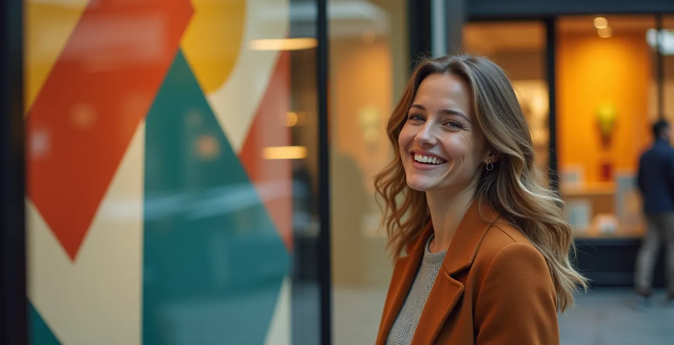
This approach is particularly powerful in the Quebec context, where Bill 96 can sometimes dilute the impact of the textual message through bilingualism or predominance constraints. By betting on a strong visual language—unique geometric shapes, signature colors, identity patterns—you transcend language barriers. The message is emotional and instantaneous. Your brand doesn’t just say its name; it expresses its personality, and it is this connection that triggers the act of purchase.
To apply this storefront engineering approach to your business, the next step is to perform an audit of your current facade and define clear conversion goals, integrating the constraints and opportunities unique to your location.