For a values poster to stop being mere decor and become a corporate culture tool, every technical choice must be a strategic decision.
- The choice of paper (satin, matte) and support (Foamcore, frame) must be dictated by the Quebec office environment (lighting, humidity) and the message to be conveyed.
- Design must be part of a unified communication system, consistent between office walls and digital platforms like Slack.
Recommendation: Treat your posters not as decorative objects, but as an ambient communication system that must be durable, contextual, and aligned with your core values.
You know them well—those corporate values posters hanging in the breakroom or the hallway. “Innovation,” “Collaboration,” “Integrity.” At first, everyone notices them. Then, they blend into the background, becoming an invisible part of the furniture. The corporate culture manager then wonders: how do we transform what has become mere wallpaper into a powerful vehicle for our identity? Many believe the solution lies in a bolder design or using logo colors. These elements are important, but they are only the surface.
The true effectiveness of office signage is played out not just on aesthetics, but on a series of often-overlooked technical decisions. This is where our approach lies: considering each poster not as an object, but as an element of an ambient communication system. The question is no longer “is it beautiful?” but “does this material choice reinforce our message?”. The Quebec summer humidity that makes a paper that is too thin curl is not just a technical problem; it is a message of fragility that contradicts a displayed value of “resilience.”
This article is designed for you—office and corporate culture managers—who wish to go beyond decoration. We will explore how material intentionality—the deliberate choice of paper, support, finish, and format—transforms a simple poster into a strategic and sustainable management tool. You will discover how technical constraints, far from being obstacles, are opportunities to communicate your values with more depth and authenticity, perfectly suited to the specific context of Quebec work environments.
This article will guide you through crucial decisions, from choosing paper for specific lighting to designing a dynamic display that evolves with your culture. Let’s dive into the art of making your company walls speak.
Summary: Transforming Your Office Walls into Corporate Culture Drivers
- Why is satin the best compromise for posters under neon lighting?
- Foamcore mounting vs. framing: Which finish for a 2-year lifespan?
- How to design a poster triptych to dress a large conference room wall?
- The mistake of printing on paper that is too thin and curls with summer humidity
- When to use snap frames to change messages every month?
- What font size should you use for a banner to be readable from 50 meters on the highway?
- How to create visuals that perform just as well on a bus shelter poster as on Instagram?
- Matte or glossy paper: Which support to choose to maximize readability for your 50-page report?
Why is satin the best compromise for posters under neon lighting?
Office lighting is rarely neutral. Between the cold neon lights above workstations, warmer task lamps, and changing natural light, a poster is subject to very variable light conditions. The choice of paper finish is therefore not just an aesthetic detail; it is a strategic decision to guarantee readability and the correct perception of your message. A paper that is too glossy (lustre) under direct neon will create intense reflections, making reading difficult and sending a message of visual aggression. Conversely, a completely matte finish can look dull under low light, absorbing too much light and lacking dynamism.
This is where the satin finish reveals its full relevance. It represents the perfect middle ground for office environments. Its slightly textured surface diffuses light instead of reflecting it directly, which minimizes distracting glare while maintaining color vibrancy. This choice conveys a value of professionalism and balance. It says: “We are modern and dynamic (unlike pure matte), but also accessible and concerned about your comfort (unlike aggressive glossy).” It is a perfect example of material intentionality, where the support itself carries part of the message.
The following table illustrates how each finish interacts with lighting and the perception of your company’s values.
| Finish Type | Rendering under LED | Reflection Resistance | Value Perception |
|---|---|---|---|
| Matte | No reflection | Excellent | Authenticity, Sobriety |
| Satin | Soft reflections | Very good | Professionalism, Modernity |
| Lustre/Glossy | Intense reflections | Low | Boldness, Innovation |
By opting for satin, you make a pragmatic choice that ensures your message’s visibility throughout the day, while subtly communicating a balanced corporate culture that cares about the well-being of its teams.
Foamcore mounting vs. framing: Which finish for a 2-year lifespan?
A values poster is not an ephemeral message. It must stand the test of time, and in Quebec, that includes the test of the seasons. The choice of support is therefore crucial to guarantee contextual durability. A simple paper poster tacked to the wall will degrade quickly, sending a signal of neglect. For a 2-year investment, two main options are available: mounting on a rigid panel or classic framing. Mounting offers a modern, clean look without a border, fitting perfectly into contemporary offices. However, not all panels are equal, especially when faced with summer humidity.
A case study conducted by a Montreal company is particularly enlightening. After 24 months, they found that standard Foamcore warped after only 8 months due to humidity reaching 80%. In contrast, denser supports like Gatorfoam maintained their rigidity. This study on the resistance of display supports showed that frames, though more traditional, offered superior protection to the paper itself, extending its lifespan.
The choice between mounting and framing depends on your budget and objectives. The illustration below shows the difference in structure between the main rigid supports.
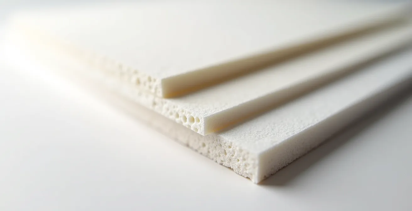
As shown in this image, material density is a key factor in longevity. Foamcore is light and economical, ideal for short-term needs. For a 2-year display in a potentially humid environment, investing in a more robust support like Gatorfoam or opting for a quality frame is a decision that protects not only your financial investment but also the integrity of your message. A support that lasts communicates the permanence of your values.
Ultimately, investing in a durable support is affirming that your values are not a passing fad, but a long-term commitment.
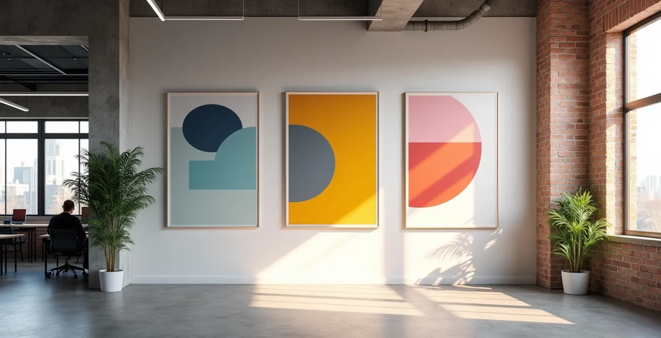
How to design a poster triptych to dress a large conference room wall?
A large empty wall in a conference room is not a problem; it’s an opportunity. Rather than filling it with a single giant poster, designing a triptych transforms the surface into a narrative space. This approach allows you to tell a story, sequence an idea, and create a visual rhythm that is much more engaging than a single image. A well-designed triptych can guide thought, whether for visiting clients or for your teams during a brainstorming session. The key is not to see the three panels as separate elements, but as chapters of the same story.
Designing an effective triptych follows a clear narrative logic. Here are the steps to structure your visual story:
- Define your narrative arc: Panel 1 can present a challenge or a question (“The Problem”). Panel 2 explains your unique approach or solution (“The Solution”). Panel 3 reveals the impact, result, or future vision (“The Impact”).
- Create visual consistency: Use a unified color palette and font family across all three panels so they are perceived as a cohesive whole. A visual element can even flow from one panel to the next.
- Integrate local roots: For a Quebec company, collaborating with artists from Montreal, Quebec City, or Sherbrooke for each panel can create a unique work deeply rooted in local culture.
- Plan for modularity: Design the central panel to be interchangeable. This allows you to update your message (e.g., presenting a new project each quarter) without having to redo the entire set.
- Respect proportions: Leave a gap of 5 to 10 cm between each panel. This “breathing space” is essential to create rhythm and allow each element of the narrative to be appreciated individually before moving to the next.
To ensure that your display project is well-aligned with your strategic objectives, a verification is necessary.
Your Roadmap for Strategic Signage
- Touchpoints: List all walls and spaces (conference room, cafeteria, entrance) where company values must be communicated.
- Collection: Inventory existing posters, paintings, and other visual elements. Are they consistent or dissonant?
- Consistency: Compare each existing visual element to your values charter. Is the message aligned? Is the support (matte, glossy, framed) in line with the value being promoted?
- Memorability/Emotion: Evaluate if your visuals are unique and evoke an emotion, or if they are generic and interchangeable with those of a competitor.
- Integration Plan: Set priorities for replacing dissonant elements and filling “empty walls” with narrative projects like a triptych.
By transforming a simple wall into a story in three acts, you are not just decorating a space; you are creating a permanent communication tool that reinforces your culture with every glance.
The mistake of printing on paper that is too thin and curls with summer humidity
Imagine the scene: you have invested in a beautiful design for your new values posters. They are installed in June. In August, after a few weeks of heat and humidity typical of a Quebec summer, the edges start to curl. The poster looks tired, neglected. The “Excellence and Rigor” message it carries suddenly becomes ironic. This is the most common and damaging mistake: underestimating the impact of the environment on the support. Paper that is too thin (less than 200 gsm) acts like a sponge for humidity. It soaks up water, its fibers swell, and the paper warps irreversibly.
To avoid this trap, the rule is simple: paper weight is your first line of defense. For a climate like Quebec’s, it is recommended never to go below a certain threshold. According to printing standards adapted to humid climates, a weight of 250 gsm is an absolute minimum for an unprotected poster. This weight ensures enough rigidity to resist moderate hygrometric variations. However, for optimal protection, weight alone is not enough. Laminating is the most effective solution. This involves applying a thin plastic film (matte or satin) to the poster, sealing it against moisture.
The choice of solution depends on your budget and desired lifespan. This table compares the most common options for protecting your posters from humidity.
| Solution | Additional Cost | Effectiveness | Protection Duration |
|---|---|---|---|
| Matte Lamination | +15% | 95% | 3-5 years |
| Satin Lamination | +15% | 95% | 3-5 years |
| Vinyl Support | +30% | 100% | 5+ years |
| PVC Support | +40% | 100% | 10+ years |
By investing in thicker paper or lamination, you are not just protecting an image. You are demonstrating that your commitment to your values is as solid and resistant as the support that displays them.
When to use snap frames to change messages every month?
Your corporate culture is not static; it is alive and evolving. You launch new projects, celebrate new successes, welcome new teams. A static display, even a beautiful one, can quickly become obsolete. Snap frames are the perfect solution for communication spaces that require agility: the entrance, the cafeteria, or project zones. Their simple mechanism allows anyone to change the poster in less than a minute, without tools. It is the ideal tool to move from “permanent” values displays to a “dynamic” communication system.
Using snap frames is particularly relevant in several scenarios:
- Monthly Communications: To display the month’s goals, the “team hero,” or key results.
- Internal Campaigns: To promote events, wellness initiatives, or recruitment periods.
- Safety or Info Messages: To disseminate important information that changes regularly.
Ease of updating is at the heart of these frames’ appeal, as suggested by the image below.
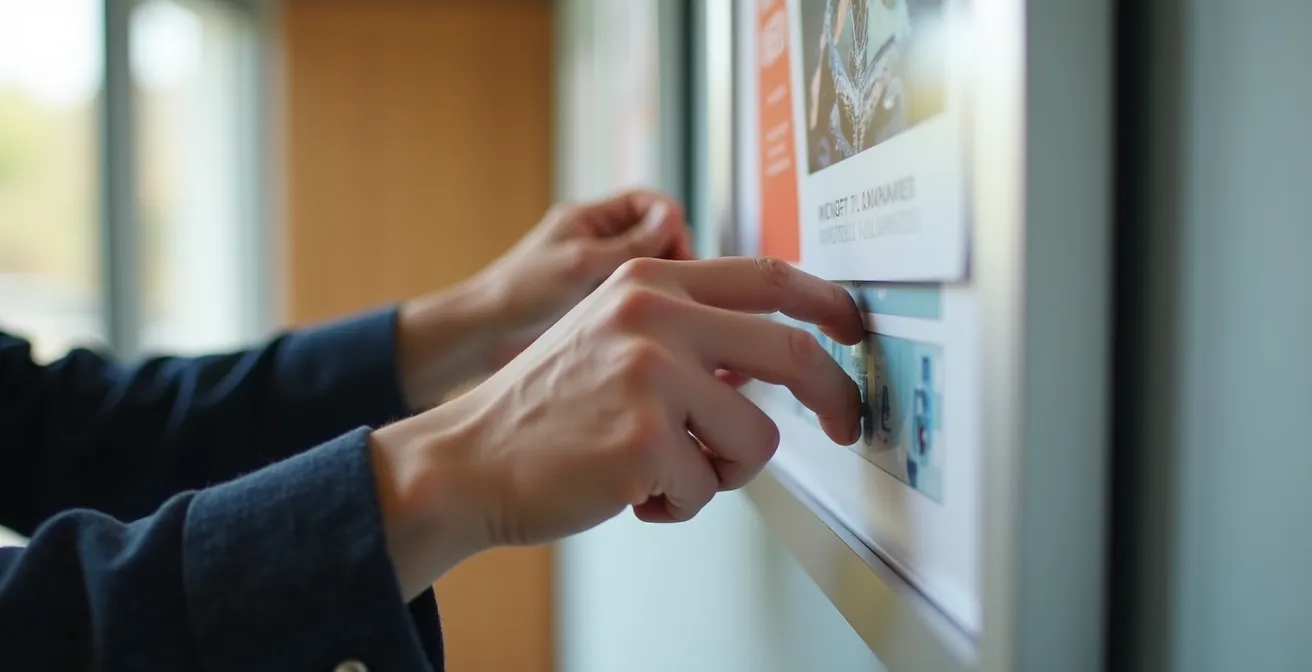
These frames transform wall communication from a static statement into a continuous conversation. For a corporate culture manager, it is a powerful way to maintain engagement and show that company values are not just written on a wall, but are lived and celebrated daily. Furthermore, with as few as 4 changes per year, the investment in the frame becomes more cost-effective than repeated printing and mounting.
By adopting a flexible solution, you send a clear message: your culture is dynamic, responsive, and constantly evolving, just like your business.
What font size should you use for a banner to be readable from 50 meters on the highway?
While the question of readability at 50 meters is crucial for a highway banner, the underlying principle is directly applicable at the office scale. How do you ensure that the key message of a poster is readable from the other side of the open space or when walking quickly down a hallway? The answer lies in a simple but fundamental design rule. Professional display design standards recommend an easy-to-remember rule: you should plan for approximately 1 cm of character height for every meter of reading distance.
Let’s apply this rule to an office environment. If the maximum reading distance in your large workspace is 15 meters, the main title of your poster should have letters at least 15 cm high to be instantly decipherable. This might seem huge, but the goal is effortless readability. For shorter distances, such as in a hallway (5 meters), a height of 5 cm would be sufficient. This principle forces you to prioritize information. Not everything can or should be read from afar. Only the main message should “pop.”
Once your main title size is determined, you can create a clear visual hierarchy for the rest of the content:
- Main Title (the key message): 100% of the calculated size. This is the hook that must be read from afar.
- Subtitle (the context): About 60% of the main size. It should be readable at mid-distance.
- Explanatory Text (the details): About 30-40% of the main size. It is intended to be read up close, once the reader is engaged.
By thinking of readability not as a constraint but as a strategy, you ensure that your values are not just displayed, but are seen and understood by everyone, no matter where they are in the workspace.
How to create visuals that perform just as well on a bus shelter poster as on Instagram?
The challenge of modern communication is consistency. An employee sees a beautifully designed values poster in the hallway, then opens Slack and encounters an internal banner with a completely different design. This dissonance, even subtle, weakens the impact of your message. The solution is to think of your visual communication not as a series of unique creations, but as a unified design system (“Value-Driven Design System”). The goal is to create a visual identity so strong and consistent that it is instantly recognizable, whether on a 2-meter-high physical support or a 6-inch phone screen.
This system rests on a few fundamental pillars:
- A Limited Color Palette: 3 to 5 proprietary colors used consistently across all media.
- One or Two Typefaces: Always using the same fonts for headings and body text reinforces recognition.
- A Bank of Icons or Graphic Elements: A unique illustration style or set of icons creates a memorable visual signature.
Our unified design system allowed us to reduce creation time by 60% while increasing the consistency of our message. Employees instantly recognize our values, whether on the office wall or on Slack.
To bridge the gap between physical and digital, a simple and effective tactic is integrating QR codes on your office posters. A QR code can link to a video on the intranet, a detailed blog post about the value in question, or a dedicated Slack channel. This transforms the static poster into a gateway to a richer content ecosystem, creating a fluid and interactive communication experience.
Ultimately, a unified design system doesn’t just harmonize your visuals; it demonstrates that your values are the true thread connecting every aspect of your company.
Key Takeaways
- Material Intentionality: Every technical choice (paper, support, finish) is an opportunity to communicate a value and must be a strategic decision, not just an aesthetic one.
- Contextual Durability in Quebec: Resistance to humidity (weight, lamination) and the choice of rigid supports (Gatorfoam) are essential to ensure the longevity of your message against the local climate.
- Unified Communication System: Visual consistency between physical posters and digital media is crucial to reinforce the impact of your corporate culture and optimize creative processes.
Matte or glossy paper: Which support to choose to maximize readability for your 50-page report?
While this question is particularly acute for a long report, it is just as relevant for a text-heavy poster, especially in the Quebec context where compliance with Law 96 often requires bilingual displays. The choice between matte and satin (or glossy) paper is not just a matter of taste; it is a commitment to accessibility and reading comfort. As Marie Tremblay, an expert in inclusive communication, points out:
Matte is not just an aesthetic choice; it is a commitment to accessibility and inclusivity in the workplace.
– Marie Tremblay, Visual Accessibility Guide in the Workplace
For any medium intended to be read carefully, matte paper is almost always superior. Its total lack of reflection eliminates eye strain and guarantees perfect readability from any angle and under any lighting. It is the choice of sobriety, clarity, and respect for the reader. Satin paper, while more dynamic, can introduce reflections that, even if slight, constitute a barrier to prolonged reading. For a poster containing detailed company values or important information, matte ensures the message is accessible to all, including those with visual sensitivities.
This table highlights the benefits of matte paper for displays that prioritize text and clarity, particularly in a bilingual setting.
| Criterion | Matte Paper | Satin Paper |
|---|---|---|
| Long-term Reading Comfort | Excellent (no eye fatigue) | Average (possible reflections) |
| Text Contrast | Very good | Good |
| Visual Accessibility | Optimal (recommended) | Fair |
| Law 96 Compliance | Facilitates FR/EN hierarchy | Neutral |
By choosing a matte finish for your textual communications, you are doing more than printing words. You are materializing a fundamental value: that of clear, inclusive communication that respects everyone’s attention.
Frequently Asked Questions on Office Poster Design
At how many changes per year does a snap frame become profitable?
With as few as 4 changes per year, a snap frame becomes more economical than repeated printing and mounting on rigid supports. The initial investment in the frame is typically amortized in less than 8 months, while offering unparalleled communication flexibility.
How do you ensure compliance with Law 96 with snap frames?
The flexibility of snap frames is an asset for compliance. Prepare your poster files ensuring that French has a clear visual predominance (for example, occupying at least 2/3 of the space or with a significantly larger font). Always keep up-to-date replacement versions ready to be inserted, facilitating quick adjustments if needed.
Which snap frame sizes are the most versatile?
Standard A1 (594 x 841 mm) and A2 (420 x 594 mm) formats offer the best balance for office use. The A1 format has a strong visual impact in large spaces like entrances or cafeterias. The A2 format is more versatile, ideal for hallways, meeting rooms, or project zones, providing good visibility without overwhelming the space.