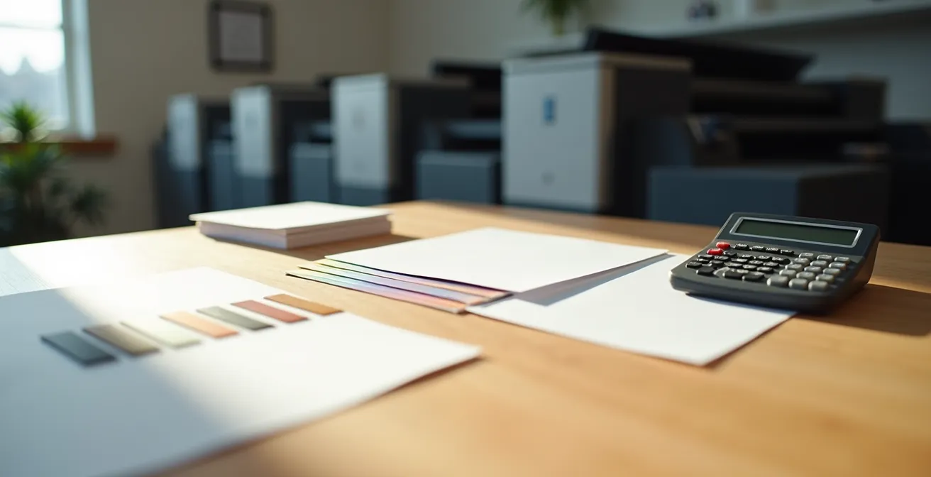
A printer’s quote is not just a price list; it is the manufacturing plan for your project. Understanding its internal logic is the key to avoiding costly mistakes.
- Paper weight (lb) alone does not define rigidity; the distinction between “Text” vs. “Cover” is fundamental.
- “Flat” and “finished” formats directly impact costs and grain direction, which affects folding quality.
Recommendation: Use every line of the quote not just as a cost, but as a technical specification to be validated against the final use of your document (report, menu, brochure).
Receiving a printer’s quote can quickly become a source of confusion. Faced with terms like “100 lb Cover,” “3D spot UV,” “creep,” or “long grain,” a junior buyer often feels overwhelmed. It is tempting to simply compare the “Total” line of several bids, hoping to have made the right choice. Yet, this approach is the cause of many costly errors: brochures that crack at the fold, booklets that are too flimsy, or business cards that fail to reflect the company’s image.
A common mistake is viewing a quote as a simple shopping list. People focus on individual terms without grasping their interdependence. But what if the real key wasn’t memorizing a dictionary of jargon, but understanding the manufacturing logic hidden behind every line? A quote is, in reality, a detailed plan for transforming a raw material (paper) into a finished product (your document). Each technical term represents a physical step and has direct consequences on the cost, quality, and durability of the final product.
This article is designed as an accelerated training for you, a junior buyer in Quebec. We won’t just define words. We will teach you to think like a printer. You will discover why “100 lb” paper can be either flexible or rigid, how a simple format choice can lead to a 40% cost increase, and at what point a technical decision becomes a strategic trade-off between cost and perceived quality. By the end of your reading, a quote will no longer be an enigma, but a powerful control tool to ensure you order exactly the product you need.
To guide you through the subtleties of print specifications, this article is structured to answer the most common and critical questions. The table of contents below will allow you to navigate directly to the points that concern you most.
Summary: Decoding Professional Printing Language in Quebec
- Why the difference between “Text” and “Cover” changes the rigidity of your brochure
- How to accurately describe the spot UV you want on your card
- Long grain vs. short grain: What is the impact on your brochure’s opening?
- The mistake of confusing finished format and flat format that skews the bid
- When to provide a wider internal safety margin for guillotine cutting
- How to choose paper that resists frequent handling without tearing after 2 months
- Matte vs. glossy paper: Which stock to choose to maximize readability for your 50-page report?
- Digital vs. Offset printing: Which one to choose for a run of 500 to 10,000 copies?
Why the difference between “Text” and “Cover” changes the rigidity of your brochure
This is one of the most frequent points of confusion for a buyer. You see “100 lb” on two different quotes and assume the rigidity will be the same. This is incorrect. The term following the weight is crucial: “Text” or “Cover.” A 100 lb Text paper is significantly more flexible than a 100 lb Cover paper. Why? Because in Quebec, as in all of North America, weight is calculated based on a basis weight of 500 sheets, but the standard sheet size differs. The base sheet for “Text” paper is large (25×38 in), while the “Cover” base sheet is smaller (20×26 in). Therefore, to reach the same 100-pound weight, the individual sheets of “Cover” paper must be much denser and thicker.
Concretely, 100 lb Text paper (approx. 148 gsm) is perfect for high-quality brochures or the inner pages of a premium catalog. It is flexible and folds well. In contrast, 100 lb Cover (approx. 270 gsm) has the rigidity expected for a report cover or a standard business card. Failing to specify this suffix is an open door to major disappointment. You risk ending up with a report cover as flimsy as its inside pages.
To help you visualize and make the right technical trade-off, here is a conversion table relating North American measurement systems (lb, pt) and the metric system (g/m² or gsm) used internationally, with examples of typical usage in Quebec.
| Paper Type | Weight (lb) | Points (pt) | Grammage (g/m²) | Typical Usage in Quebec |
|---|---|---|---|---|
| Text | 70 lb | – | 104 g/m² | Brochure inside pages |
| Text | 100 lb | – | 148 g/m² | Premium brochures |
| Cover | 80 lb | 10 pt | 216 g/m² | Report covers |
| Cover | 100 lb | 14 pt | 270 g/m² | Standard business cards |
| Cover | 130 lb | 16 pt | 350 g/m² | Postcards |
In summary, the intent of your product should guide your choice. For pages that turn easily, opt for “Text.” For a feeling of solidity and durability in hand, demand “Cover.”
How to accurately describe the spot UV you want on your card
“Spot UV” (or spot varnish) is a finish that adds a glossy layer to specific areas of your document (a logo, title, pattern) to create contrast with the rest of the surface, which is often matte. It is an excellent way to give a high-end touch to a business card or brochure cover. However, “spot UV” is a generic term. To avoid any ambiguity on the quote, you must be more precise about the desired effect, as it directly impacts the result and the cost.
There are mainly two types: Standard Spot UV, which is a thin glossy layer, and 3D Spot UV (or “raised varnish”), which is much thicker and creates a volume effect perceptible to the touch. The latter is more expensive, often adding between $0.15 and $0.30 per card in Quebec, but its impact is incomparable. To order it, you will need to provide the printer with a graphic file containing a separate layer (often named “Varnish”) indicating the exact areas to be varnished in 100% K (Black).
The other crucial parameter is the base upon which the varnish will be applied. For maximum contrast and a “wow” effect, we generally request Gloss Spot UV on Matte Lamination. The effect is striking. A matte varnish on a matte base is also possible for a much more subtle and sophisticated result. Specifying these elements in your quote request allows the printer to accurately price your needs and ensures you get the look you intended.
Never forget to specify the type (standard or 3D), the base (e.g., gloss on matte), and to prepare an adequate technical file. This is the only way to master the final result.
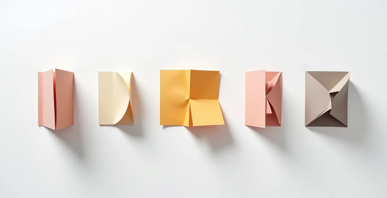
Long grain vs. short grain: What is the impact on your brochure’s opening?
Here is a technical detail that may seem obscure but is the cause of many printing disasters: the paper’s grain direction. Paper is made of cellulose fibers that, during manufacturing, mostly align in one direction. We speak of “long grain” when the fibers are parallel to the long side of the sheet, and “short grain” when they are parallel to the short side. This orientation has a major physical consequence: paper folds easily parallel to its fibers, but resists and tends to crack when folded perpendicularly.
For a brochure or pamphlet, this is a critical issue. The main fold (the “spine”) must absolutely be parallel to the grain direction to ensure a clean, flat, and durable opening. If the fold is perpendicular, the paper will “break,” the fibers will snap, the color may flake on the fold, and the brochure will refuse to stay flat. The printer chooses the grain direction based on the final format and the location of the folds. This is why it is crucial to always specify both the flat format and the finished format of your document.
Case Study: The Economic Impact of Poor Grain Orientation
A Montreal-based company made the mistake of not validating this technical point for an urgent order. The result: they had to reprint 10,000 brochures after the folds cracked the first time they were handled by customers. The hidden cost of this error amounted to $3,200 CAD for reprinting, not including a five-day delay on their marketing campaign. For any multi-panel document, confirming the grain direction with your Quebec printer is an inexpensive quality assurance measure.
Next time you order a folded document, ask the question: “Will the fold be parallel to the grain to prevent the paper from cracking?”. This simple question will demonstrate your professionalism and save you from many headaches.
The mistake of confusing finished format and flat format that skews the bid
This is a classic mistake that can blow a budget. The flat format (or open format) is the total dimension of your document when laid flat, completely unfolded. The finished format (or closed format) is its dimension once folded, as it will be delivered to your customer. Confusing the two in a quote request is a guarantee of getting a completely wrong price. The printer bases their calculation of raw material (paper surface) and imposition (the number of documents per large sheet) on the flat format.
Let’s take a common example in Quebec: a tri-fold brochure on US Letter format. Its open format is 11 x 8.5 inches. Once folded in three, its finished format is approximately 3.66 x 8.5 inches. If you request a quote for an “11 x 8.5 in” format without specifying “open,” the printer might assume that is the finished format, imagining an immense 33 x 8.5-inch document when unfolded. The reverse is also true. Indicating the small finished format while thinking of the open format will lead to a drastic underestimation of the cost, followed by a bad surprise.
The error can result in a cost increase of at least 40%, as it forces a complete overhaul of production planning: press choice, paper purchase, and setup time. To avoid this fiasco, your quote request must always be crystal clear. Distinctly specify “Flat format: W x H” and “Finished format: W x H,” specifying the number of panels and the fold type (roll fold, accordion fold, etc.). The best practice is to ask the printer for their template, which will show you the exact dimensions and fold locations.
This rigor in the initial description will save you time and money and build a relationship of trust with your supplier.
When to provide a wider internal safety margin for guillotine cutting
All graphic designers know about “bleed,” that 0.125-inch (3 mm) margin outside the final format to avoid white edges after cutting. But few buyers know its corollary: the internal safety margin (safe zone), and especially, the phenomenon that requires it to be increased. This margin is an area inside the format where no important text or logo should be placed, so as not to risk being trimmed by the guillotine.
For a document of a few pages, 0.125 inches is sufficient. But for thick documents like annual reports, catalogs, or magazines, a physical phenomenon called “creep” (or “refoulement”) comes into play. Imagine a stack of 40 sheets folded in half to form an 80-page booklet. The center pages, being inside the fold, will naturally “push out” and protrude beyond the outer pages. During the final guillotine cut, which trims the three sides of the booklet in one go, these central pages will therefore be trimmed shorter. If your logo is placed too close to the edge, it will be cut off on the middle pages!
A case study in Sherbrooke on an 80-page report showed that the center pages had been trimmed by an extra 2 mm due to creep. The solution was to increase the internal safety margin to 0.25 inches (6 mm) for the central pages of the document. According to data compiled by professional printers, it has been shown that 87% of documents over 48 pages require creep compensation. It is up to the printer to manage this compensation, but being aware of it allows you to plan safer designs for thick documents.
Your Action Plan for Validating a Print Quote
- Touchpoints: List all elements of the quote (paper, finish, format, quantity). Is the jargon clear?
- Collecting specifications: For each point, have you defined the product’s intent? (e.g., “washable menu,” “easy-to-read report”).
- Consistency: Match specifications against your intent. Is “80 lb Text” paper consistent with a “book cover”? Are open/closed formats clearly specified?
- Memorability and emotion: Does the finish (varnish, lamination) match the target brand image (premium, eco-friendly, robust)?
- Integration plan and questions: Prepare a list of specific questions for the printer on points of doubt (e.g., “Can you confirm the grain direction is parallel to the main fold?”).
If your project exceeds 48 pages, proactively discuss creep management with your printer. They will appreciate your foresight, and you will avoid a very bad surprise.
How to choose paper that resists frequent handling without tearing after 2 months
Durability is a criterion often neglected in favor of initial cost, but it is a critical technical trade-off for documents intended for frequent handling. A restaurant menu, an shop floor technical sheet, or a training catalog do not have the same constraints as a simple promotional flyer. Choosing standard untreated paper for intensive use is a guaranteed hidden cost: you will have to reprint much sooner than expected.
To increase resistance to tearing, moisture, and grease, several solutions exist, with very different levels of cost and performance. The first option is lamination (or pelliculage). This involves applying a very thin plastic film (matte, gloss, or “soft-touch”) to the paper. A matte lamination, in addition to its elegance, offers very good protection against fingerprints and wear, extending the life of a catalog by several years. This is a very common solution in Quebec.
For extreme resistance, the ultimate solution is synthetic paper (like Polyart or vinyl). This is no longer cellulose-based paper, but a plastic polymer. It is virtually tear-proof, completely waterproof, and washable. It is the ideal choice for menus, outdoor posters needing to resist the Quebec frost, or safety sheets in industrial environments. Although more expensive to purchase, its longevity makes it a very profitable investment for critical uses.
The following table compares the most common options to help you choose based on your needs and budget in Quebec. Costs are indicative for a standard format unit.
| Solution | Cost in Quebec (/unit) | Resistance | Durability | Recommended Use |
|---|---|---|---|---|
| Synthetic Paper | $0.85 – $1.20 | Tear-proof | 5+ years | Menus, outdoor sheets |
| Matte Lamination | $0.25 – $0.35 | Very good | 2-3 years | Handled catalogs |
| Gloss Lamination | $0.20 – $0.30 | Good | 1-2 years | Product sheets |
| 350g Untreated Paper | $0.10 – $0.15 | Medium | 6-12 months | Occasional use |
Before finalizing your order, ask yourself: “How many times and in what environment will this document be used?”. The answer will determine if an initial investment in a protective finish is, in reality, a long-term saving.
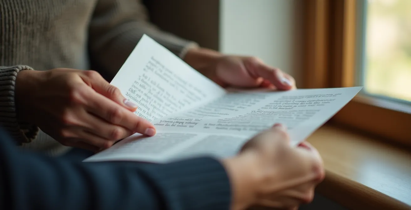
Matte vs. glossy paper: Which stock to choose to maximize readability for your 50-page report?
The choice between a matte or glossy finish is not just a matter of taste; it is a fundamental ergonomic choice, especially for long documents like annual reports, books, or training guides. Glossy paper is often associated with vibrant photos and a punchy look, but it has a major flaw: it is highly reflective. Under office lighting or natural light, it creates glares that hinder reading and increase eye strain.
In contrast, matte paper or satin finishes absorb light instead of reflecting it. It offers far superior reading comfort, which is essential for maintaining the reader’s attention on long texts. Ergonomic studies on prolonged reading confirm that matte papers reduce eye strain by 65% over reading sessions exceeding 30 minutes. The contrast between ink and paper is softer, making the overall experience more pleasant. For a 50-page report that you want read carefully, choosing matte is a clear strategic decision.
In Quebec, many companies prefer matte coated papers for their institutional publications. It is a sign of sobriety and professionalism. Furthermore, local and ecological options exist. For example, the Rolland Enviro range, produced in Quebec from 100% recycled fibers, offers a natural matte look that is highly appreciated. Choosing this type of paper not only optimizes reading comfort but also communicates strong environmental values—an increasingly important argument for brand image.
The rule is simple: for documents dominated by images and intended for rapid visual impact (flyers, magazine covers), gloss is an option. For anything involving sustained reading, matte is the professional choice par excellence.
Key Takeaways
- A print quote is a manufacturing plan: every line has a physical consequence on the final product.
- The terms “Text” and “Cover” define rigidity far more than weight (lb) alone.
- The paper’s grain direction is crucial for fold quality; it depends on the open and closed formats.
Digital vs. Offset printing: Which one to choose for a run of 500 to 10,000 copies?
This is the fundamental strategic question that most influences the unit cost of your project. Offset printing is the traditional method: it uses engraved metal plates and massive presses. Its starting cost (setup or “make-ready”) is high (between $300 and $500 fixed before the first copy is even made), but its cost per copy then becomes extremely low. Digital printing (advanced laser or inkjet) works like a giant office printer, without plates or complex setup. Its starting cost is nearly zero, but its cost per copy remains relatively stable regardless of the quantity.
The range of 500 to 10,000 copies is precisely where the break-even point (the tipping point) lies—the quantity at which offset becomes more cost-effective than digital. In Quebec, this break-even point is generally around 1,000 to 2,000 copies for a standard document. Below this, digital is almost always the winner in terms of price and speed (24-48h vs. 5-7 days for offset). Beyond this, the economies of scale of offset take over.
However, cost is not the only factor. Modern digital presses, such as the HP Indigo used by many Quebec printers, offer quality rivaling offset and a unique advantage: variable data personalization. Digital allows you to print 1,000 brochures while changing the recipient’s name on each one at no extra cost. This is impossible in offset. This trade-off between pure cost and marketing flexibility is at the heart of the decision.
The table below, based on average costs in Quebec, clearly illustrates this economic break-even point to help you make the right decision. Costs are per unit for a color US Letter flyer.
| Quantity | Digital Unit Cost (CAD) | Offset Unit Cost (CAD) | Digital Lead Time | Offset Lead Time | Recommendation |
|---|---|---|---|---|---|
| 500 | $0.45 | $0.70 | 2-3 days | 5-7 days | Digital |
| 1,000 | $0.45 | $0.35 | 3-4 days | 5-7 days | Break-even Point |
| 5,000 | $0.45 | $0.12 | 5-7 days | 7-10 days | Offset |
| 10,000 | $0.45 | $0.08 | 7-10 days | 7-10 days | Offset |
To finalize your choice, evaluate not only the quantity but also your needs regarding deadlines and personalization. A transparent discussion with your printer across these three axes will ensure you select the most suitable and cost-effective technology for your specific project.