A rejected file isn’t just a technical glitch; it’s a symptom of a missing “pre-press reflex” during the design phase.
- RGB images, while perfect for the web, are the leading cause of rejections because their color gamut is wider than what CMYK printing can reproduce, leading to dull and unpredictable colors.
- A low-resolution image (72 DPI) copied from the web will inevitably look pixelated in print, destroying the perceived quality of your design.
- Fine black text should be set to 100% pure black (K100) and configured to overprint to avoid unsightly white fringes caused by slight press misregistrations.
Recommendation: Activate the “Preflight” function in InDesign at the start of your project, not the end. It acts as a permanent safety net that detects these critical errors in real-time.
Friday, 3:30 PM. The phone rings. It’s your printer. The verdict is swift and final: “Your file is stuck in pre-press; we can’t start production.” For any freelance designer juggling deadlines, this sentence is synonymous with stress, delays, and unexpected costs. You thought you did everything right: respected the bleeds, exported as a PDF… So, what happened? Often, the answer lies in technical details that basic checklists barely scratch the surface of.
Most guides repeat the same advice: use 300 DPI images, convert to CMYK. These rules are necessary, but they aren’t sufficient. They treat the symptoms without ever addressing the root cause. The real key to securing your prints isn’t a rushed final check, but the adoption of a permanent mindset: the “pre-press reflex.” It’s about thinking like a printer at every stage of your creative process, anticipating breaking points before they even manifest.
This article isn’t just another checklist. It’s an immersion into pre-press logic, designed for you—the creative who needs to deliver impeccable work on time. We will dissect the most frequent and costly errors, not just to tell you “what” to do, but to explain “why” they block production and “how” to eliminate them permanently from your workflow. By integrating these reflexes, you won’t just be sending a file; you’ll be delivering a secured production, ready to be printed without a hitch.
To navigate these crucial technical points effectively, this article is structured to guide you step-by-step. The table of contents below allows you to jump directly to the sections that interest you most or follow a logical path to mastering the art of file preparation.
Summary: The Complete Guide to Rejection-Free Print Files
- Why RGB images are the #1 cause of production blocks
- How to ensure your black text doesn’t “knock out” the colored background
- Outlined vs. embedded fonts: Which method is safest for the RIP?
- The error of copy-pasting web images that pixelate in print
- When to activate “Preflight” in InDesign to detect errors in real-time
- How to guarantee a 72 DPI image won’t ruin your large-format brochure
- How to get quality prints in under 24 hours without paying triple the price
- Why the pre-press stage is your last chance to avoid a costly catastrophe
Why RGB images are the #1 cause of production blocks
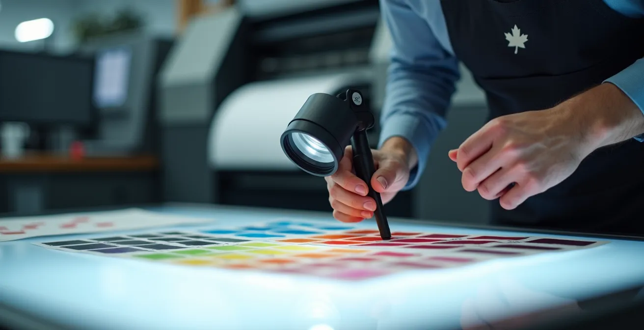
The most fundamental error, the one that triggers an immediate red alert for any pre-press technician, is the presence of RGB (Red, Green, Blue) images in a file intended for printing. This color mode, designed for light-emitting screens, is physically impossible to reproduce using the CMYK (Cyan, Magenta, Yellow, Black) inks of a press. The reason is simple: the gamut, or the range of possible colors, in RGB is much wider. RGB can display up to 16.7 million colors, while CMYK is much more restricted. A forced conversion by the printer’s RIP (Raster Image Processor) almost always results in disappointment: electric blues turn dull, and vivid greens transform into muddy shades.

This difference in gamut, illustrated above, is the heart of the problem. Leaving an image in RGB is like letting chance decide the final look of your colors. To avoid this trap, iron discipline is required from the start. Conversion shouldn’t be an afterthought but a pillar of your workflow. In Quebec, most printers work with the North American SWOP v2 color profile, which is crucial to configure in your Adobe software.
To anticipate and master this critical breaking point, here are the steps to integrate into your routine:
- Step 1: Configure your document in CMYK mode from the moment you create it in InDesign or Illustrator. This is a non-negotiable reflex.
- Step 2: Use Photoshop’s “Gamut Warning” function to visually identify RGB colors that will print poorly even before conversion.
- Step 3: Apply the appropriate ICC profile, generally SWOP v2 for North American printers, when converting your images.
- Step 4: For projects where color fidelity is critical (like a brand identity), systematically request a hard copy press proof (BAT). It’s the only true insurance.
By adopting these practices, you no longer endure color conversion—you lead it. You transform a potential source of error into a controlled quality check, ensuring that what you see on screen is as close as possible to the printed result.
How to verify that your black text doesn’t “knock out” the colored background
Black text that appears slightly blurry or surrounded by a thin white fringe on a colored background is a classic print defect. This problem stems from poor management of “knockout” and “overprint.” By default, to prevent inks from mixing, software creates a “knockout”: it reserves an unprinted area under the text. However, on a press running at high speed, a micro-shift of a few fractions of a millimeter (misregistration) is enough to reveal this unsightly white gap.
For fine text (generally below 12 points), the solution is overprinting. Instead of “punching a hole” in the background, the black prints directly on top of it. The risk of white fringes disappears completely. Most printers handle this automatically via their RIP, but it is safer to specify it yourself in the object attributes in InDesign or Illustrator. Be careful, however: this technique is reserved for 100% pure black (K100). Applying overprint to any other color would change its hue by mixing it with the color underneath.
The Standard Rich Black Recipe in Quebec
For large areas of black (like a page background), 100% pure black can look a bit washed out. Quebec printers use a “rich black” to achieve superior depth and density. A very common formula is C60 M40 Y40 K100. This recipe guarantees a deep black without overloading the paper with ink, which could cause drying issues (set-off). It is crucial never to apply this formula to fine text, as the four layers of ink would make perfect registration impossible, creating a guaranteed blurry effect.
The golden rule is simple: for fine text and lines, use pure black (0/0/0/100) with the overprint attribute activated. For large black areas, use the rich black recommended by your printer, ensuring it is set to knockout and not overprint. This distinction is a detail that separates amateur work from a professional result.
This rigorous management of black is a perfect example of the “pre-press reflex”: anticipating a physical press problem (registration) directly within your design software to guarantee an impeccable result.
Outlined vs. embedded fonts: Which method is safest for the RIP?
A missing font is a death sentence for a file in pre-press. If the printer’s system doesn’t have the font used in your document, it will substitute it with a default font (often Courier), instantly ruining your layout. To avoid this disaster, two solutions exist: embedding and outlining (vectorizing). Each has its advantages and ideal usage context.
Embedding consists of including the font file within the PDF. This is the standard method for long texts (paragraphs, articles). When you export to PDF/X-1a, InDesign automatically embeds the fonts used, provided their license allows it. This is the cleanest solution because it preserves the editability of the text (if last-minute corrections are needed) and its optimization for legibility.
Outlining transforms the text into a graphic object—a series of points and curves. The text is no longer text, but an image. This method offers absolute security: there is no longer any dependency on a font file. However, it has drawbacks. As confirmed by professional technical recommendations, outlining can increase the file weight by 15 to 30% and makes text corrections impossible. Furthermore, for very small font sizes, it can slightly alter the sharpness of the characters.
The best practice, widely adopted by Quebec agencies and SMEs, is a hybrid approach:
- Always outline: logos, creative titles, signatures, and any branding elements where the letterform is a crucial design element.
- Always embed: paragraphs, captions, and all main body text via a PDF/X-1a export.
- Check permissions: In Acrobat, go to `File > Properties > Fonts` to verify that all your fonts show “(Embedded Subset)”.
- Test special characters: Ensure that French-specific characters like ligatures (œ, æ) and accented capitals (É, À) are correctly handled.
By applying this golden rule, you combine the absolute security of outlining for your key graphic elements with the flexibility and lightness of embedding for textual content, creating a file that is both robust and optimized.
The error of copy-pasting web images that pixelate in print
It’s a frequent temptation when meeting tight deadlines: find an image on the web, copy-paste it directly into your design, and hope for the best. It is also the almost certain guarantee of a disastrous print result. Images displayed on websites are optimized for loading speed: they are compressed, and their resolution is 72 DPI (dots per inch), which is sufficient for screen display.
Printing, on the other hand, is a much more demanding process that requires much higher information density. The professional standard is 300 DPI to guarantee a sharp and detailed image. A 72 DPI image printed at the same physical size will appear blurry, with clearly visible pixel blocks—a pixelation effect that instantly discredits any communication piece.
The difference, as shown in this comparison, is brutal. The problem is that layout software won’t always alert you in an obvious way. It will display the image correctly, masking the upcoming catastrophe. The pre-press reflex here is to never, ever use an image for which you do not have the high-resolution source.
Emergency Solution for an Irreplaceable Low-Res Image
Sometimes, you’re stuck with a unique low-resolution image (like an archival photo). If replacing it is impossible, all is not lost. AI-based upscaling tools can work wonders by recreating missing information. Tests have shown that a 72 DPI photo enlarged to 300 DPI via AI could maintain acceptable sharpness for small-format prints (A5 size). For large format, the result remains insufficient. A more “manual” alternative is to apply a very slight Gaussian blur (1 to 2 pixels) to the image to hide the hard pixel edges and make the defect less aggressive—a last-resort technique.
Ultimately, the quality of your prints is directly linked to the quality of your sources. Investing time to find or buy high-resolution images isn’t an expense; it’s insurance against a failed production.
When to activate “Preflight” in InDesign to detect errors in real-time
The “Preflight” function (Contrôle en amont) in InDesign is the most powerful, yet most underutilized, tool for avoiding file rejections. Many designers only use it at the very end, just before exporting the PDF. This is a mistake. Preflight should not be a final check but a permanent co-pilot that signals errors as you work.
Preflight should ALWAYS be activated from the moment the document is created. It is your safety net that transforms last-minute stress into permanent quality control.
– Prepress Expert, InDesign File Preparation Guide
Think of it as a spellchecker for technical printing errors. A small green light at the bottom of your InDesign window tells you everything is compliant. If it turns red, a problem has been detected (an RGB image, a missing font, low resolution…). By clicking it, you get a detailed report of the error and its exact location, allowing you to fix it instantly.
The trick is not to settle for the default profile but to create your own “Standard Quebec Printer” profile with the strictest settings—those your printer will use to validate your file. This allows you to perfectly align your creative constraints with production requirements.
Your Action Plan: Create a “Standard Quebec Printer” Preflight Profile
- Contact points: Define alerts for common errors. Open the Preflight panel (Window > Output > Preflight) and create a new profile.
- Collection: Inventory critical parameters. Activate rules for: Minimum image resolution (set to 280 DPI), Color Space (alert if other than CMYK or Grayscale), Bleeds (minimum 0.125 inch or 3mm).
- Consistency: Match font requirements. Ensure the “Missing Fonts” rule is checked to signal any unavailable fonts.
- Memorability/Emotion: Identify ink coverage issues. In the “Color” section, activate “Total Ink Coverage” and set it to 280% to avoid overloaded blacks and drying problems.
- Integration Plan: Save this profile and activate it by default for all your new print documents. The Preflight light will become your best ally.
By working with this active safety net, the final export phase becomes a mere formality. You no longer hope your file is correct; you know it is, because you corrected the problems the moment they appeared.
How to guarantee a 72 DPI image won’t ruin your large-format brochure
The “300 DPI” rule is a great starting point, but it’s not a universal law. The required resolution for an image actually depends on a crucial factor: viewing distance. An image intended to be seen very closely, like on a business card, requires maximum point density so the eye perceives no pixelation. Conversely, an image on a highway billboard, seen from dozens of meters away, can have a very low resolution without looking jarring.
Using a 300 DPI image for a 4×3 meter billboard would create an astronomically heavy file, impossible for the printer’s RIP to handle. The key is to adapt resolution to the final use. For a brochure or flyer (read at about 30 cm), 300 DPI remains the standard. For a wall poster seen at one or two meters, a resolution of 150 to 200 DPI is often more than sufficient and significantly lightens the files.
This simple comparison table, based on printer standards, is an excellent guide for choosing the right resolution and avoiding unnecessarily overloading your files or, conversely, ruining a large-format project with an unsuitable image.
| Reading Distance | Medium | Min Resolution | Optimal Resolution |
|---|---|---|---|
| 30 cm | Business card, flyer | 250 DPI | 300 DPI |
| 1 meter | Poster | 150 DPI | 200 DPI |
| 3 meters | Exhibition booth | 100 DPI | 150 DPI |
| 10+ meters | Highway billboard | 30 DPI | 50 DPI |
STM Ad Analysis: Differentiated Resolution
An analysis of a Montreal STM (transit) ad in a bus shelter perfectly illustrates an intelligent resolution strategy. The background image, a cityscape, is at 100 DPI, which is sufficient for someone viewing the poster from two meters away. However, the STM logo, website URL, schedules, and practical info are vector elements, guaranteeing perfect sharpness even for someone leaning in to read details. This hybrid approach reduced the final file weight by over 60% while preserving optimal perceived quality for every design element.
Understanding this relationship between resolution and distance gives you immense flexibility. It allows you to work with lighter files, save time in processing and transferring, and make informed decisions that guarantee quality where it truly counts.
How to get quality prints in under 24 hours without paying triple the price
Urgency is a reality of the design profession. A client needs 500 flyers for an event the next day. Turning to 24-hour express printing services is possible, but it requires understanding and accepting a specific economic model: gang-run printing (amalgame). This technique consists of grouping the orders of several clients onto the same large sheet of paper. This is what allows press setup costs to be split and offers very competitive prices. In fact, gang-run printing allows for up to 70% savings on short runs, but this gain comes with a trade-off.
The main compromise of gang-run printing is limited control over colorimetry. Your project sits next to another that may have a very different dominant color. The printer will seek an average ink balance for the entire sheet, meaning your brand color fidelity cannot be 100% guaranteed. For a promotional flyer, this is often acceptable. For a corporate brochure where a Pantone color must be exact, gang-run is to be avoided.
To succeed in your express print without nasty surprises, the key is simplification and speed of execution. Rapid printers work with highly automated production flows. The slightest snag in your file will set it aside and cause you to miss the production window.
Here is the emergency checklist for 24-hour printing in Montreal:
- Before 10 AM: This is generally the cutoff time. Your files, in PDF/X-1a format, must be validated and uploaded to the printer’s platform.
- No complex finishes: Forget spot UV, die-cutting, embossing, or matte lamination. These operations require additional production and drying time incompatible with a 24-hour turnaround.
- Immediate payment: Production is only triggered upon receipt of payment. Pay online by credit card to avoid losing a minute.
- Standard formats only: Stick to classic sizes like A4, A5, or North American business card format (3.5 x 2 inches).
- Local pickup option: If you are in Montreal, choosing to pick up your order directly from the print shop can save you 24 hours of shipping time.
In short, 24-hour printing is an excellent emergency service, provided you accept the rules: simplicity, standardization, and a technically flawless file submitted on time.
Key Takeaways
- The “pre-press reflex” isn’t a final check; it’s a work discipline that involves anticipating print constraints at every stage of design.
- The three major breaking points causing most rejections are: RGB colors, image resolutions unsuitable for viewing distance, and poor management of black text overprinting.
- Permanently activating the “Preflight” function in InDesign, with a custom profile, is the most effective way to turn submission stress into a continuous and serene quality control process.
Why the pre-press stage is your last chance to avoid a costly catastrophe
The pre-press stage is not a simple administrative formality. It is the last wall, your ultimate safety net before your design is irreversibly etched onto thousands of sheets of paper. An error that passes this stage cannot be fixed with “Ctrl+Z.” It is fixed with a new purchase order and a check. The financial impact of an error detected too late can be enormous. According to average data from Quebec printers, having to reprint 5,000 brochures because of a typo or bad color can easily cost $2,000, whereas a hard copy press proof (BAT), which would have detected the error, only costs about $75.
The pre-press technician is not your enemy. They are your most valuable partner in the success of your project. Their role is to anticipate how your digital file will behave once confronted with the physical reality of inks, paper, and the mechanics of a press. They check the points we’ve covered, but also dozens of others: total ink coverage, the presence of crop marks, bleed size, PDF format validity…
Validating a press proof (physical or digital) provided by the printer is therefore an act of capital importance. It is your signature, your final agreement that releases your responsibility and transfers it to the printer. Proofreading it with care—checking every phone number, every address, every color—is the best insurance you can take. It is your last opportunity to say “stop” before committing hundreds or thousands of dollars.
For your next project, don’t just send a file into the void. Start a conversation with your printer. Ask questions. Request a press proof. This proactive communication is the guarantee of peace of mind, respect for your deadlines, and ultimately, a printed result you can be proud of.
Frequently Asked Questions on Preparing Files for Print
What is the dot gain of your press?
This information allows you to adjust gray values and half-tones to compensate for ink spreading on paper—a phenomenon that varies by paper type (coated vs. uncoated) and press.
Do you have a specific PDF profile you can provide?
Yes, it is always best to ask. Each printer may have their own settings optimized for their equipment and papers. Using their profile guarantees maximum compatibility.
Is black overprinting handled automatically by your RIP?
This is a crucial question. Knowing whether you must manually manage 100% black overprinting in your file or if the printer’s RIP does it automatically prevents issues with text knocking out the background or, conversely, unnecessary double overprints.