
The performance of an omnichannel visual does not depend on variations, but on the design of a modular “master visual” from the very beginning.
- A concept thought out in advance for media fragmentation avoids “format friction” and guarantees consistency.
- Context (speed, distance, medium) dictates composition rules, from the amount of text to font size.
Recommendation: Stop thinking in terms of “adaptation” and start driving a “visual content architecture” to maximize the return on every dollar invested in creation.
For a marketing manager in Montreal, the day is a permanent balancing act. In the morning, you approve the proof for a billboard campaign for the Berri-UQAM metro station, where the message must hit home in three seconds. In the afternoon, you analyze the performance of a sponsored story on Instagram, where interaction is king. In between, a web banner, a LinkedIn carousel, and a flyer for raddar. The challenge is immense: how to ensure a strong and consistent brand presence across channels that are poles apart?
The usual reflex is to focus on variations. We create a visual, then ask the graphic designer to “adapt” it for each platform. We talk about ratios, safe zones, and export formats. These technical considerations are necessary, but they are only the tip of the iceberg. They treat the symptom, not the cause. If a visual is fundamentally poorly conceived, no amount of adaptation will save it. It will lose impact, readability, and ultimately, performance.
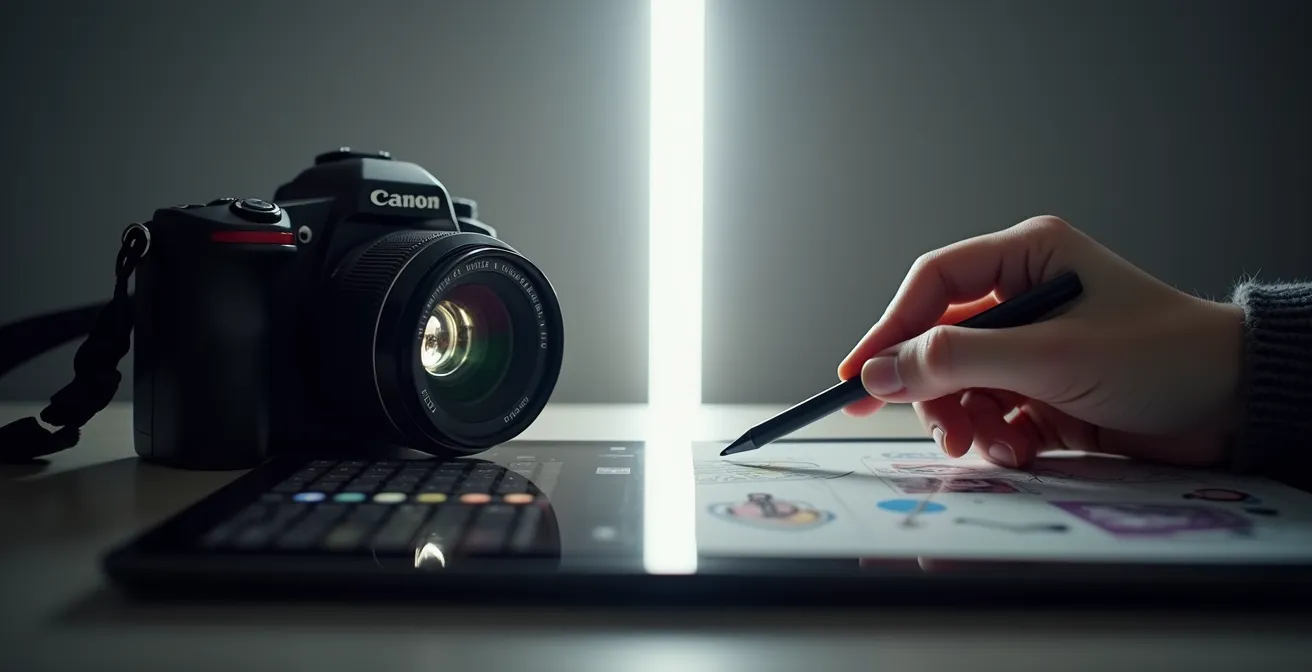
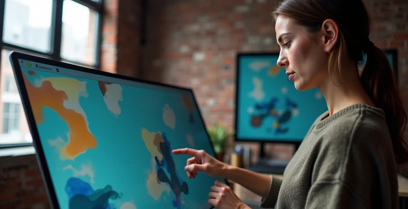
But what if the true key wasn’t in the multiplication of adaptations, but in the intelligence of the original design? What if the secret of a visual that performs everywhere resided in its initial architecture? The solution is to move from a logic of variation to a strategy of modular design. It involves creating a “master visual” not as a static image, but as a system of elements (image, headline, logo, call to action) designed to be reorganized without ever betraying the central creative idea.
This article offers a strategic roadmap to achieve this. We will deconstruct common mistakes and build a methodology together so that your visuals perform with the same intensity on a 4×3 meter billboard along the Décarie and on a phone screen in the comfort of a Mile End café.
To effectively navigate through the different facets of this strategy, here are the key points we will address. This summary will guide you from the foundations of multi-channel composition to practical applications specific to the Quebec market.
Summary: Omnichannel Visual Strategy: From Idea to Performance
- Why doesn’t a horizontal photo work on a vertical banner?
- Vector illustration or photoshoot: which style ages better for a brand?
- 4x3m billboard vs. mobile screen: how much text does the brain retain?
- The mistake of using free image banks that everyone has already seen
- When to create the “master” visual to facilitate its 20 future variations?
- What font size to use so a banner is readable from 50 meters on the highway?
- Why a $2,000 investment in graphic design pays off more than mass printing?
- How to succeed in your flyer campaign in Publisac or by mail despite the decline of paper?
Why doesn’t a horizontal photo work on a vertical banner?
The answer seems obvious: “because the format is not the same.” But this simplicity hides a major strategic issue I call format friction. It’s not just about cropping an image, but respecting its compositional intent. A horizontal landscape photo is designed for the eye to sweep from left to right, following lines of perspective and a visual narrative. Trying to “crop” it into a 9:16 format for an Instagram story is like tearing away 70% of the story. You don’t get a “vertical” version, but an incoherent fragment.
The focal point, the balance of masses, the negative spaces… everything that makes a composition effective is destroyed. The result is a lopsided visual, where the main subject is either off-center or cut in an absurd way. This is the sign of a visual strategy thought out in a silo, where each medium is a problem to be solved after the fact, rather than a planned opportunity from the start.
Montreal agencies and production houses have understood this well. As Frank Agence’s approach for its digital campaigns highlights, distributing web content, whether for a site or social networks like YouTube and Instagram, requires a native adaptation for each medium. It’s not about forcing one format into another, but about creating variations that respect the codes and uses of each platform to generate maximum engagement. A high-performing visual is one that looks like it was created specifically for the medium on which it appears.
Vector illustration or photoshoot: which style ages better for a brand?
The choice between photography and illustration is not just a matter of taste; it is a strategic decision that impacts the longevity and flexibility of your brand identity. A photo session, especially if it is anchored in an era (fashion, technology, hairstyles), has an expiration date. It captures a moment with authenticity, but that moment eventually passes. A campaign based on a photoshoot from 2020 may already look dated today. This is a risk, especially when we know that advertising investments are shifting massively toward channels where freshness is paramount.
Indeed, the Quebec media landscape has been disrupted. A study by the Centre d’études sur les médias reveals a 67% drop in advertising revenue for Quebec daily newspapers between 2012 and 2022. This money hasn’t evaporated; it has moved to digital, a world that demands agility and a capacity for constant evolution. In this context, vector illustration offers two major advantages: timelessness and modularity. A well-defined illustrative style is less sensitive to trends. It can evolve smoothly, in small touches, without requiring a complete overhaul.
More importantly, illustration is intrinsically modular. Each element (character, object, setting) is a distinct layer that can be isolated, rearranged, recolored, or animated with disconcerting ease. This makes it the ideal candidate for a “master visual” strategy. You can create a complex scene for a billboard, then extract a single character for a story, an object for an icon, or animate elements for a web banner. Photography offers the emotion of the moment; illustration offers the durability and flexibility of a system.
4x3m billboard vs. mobile screen: how much text does the brain retain?
Viewing context is the absolute master of visual performance. The same individual does not have the same attention span or reading behavior whether they are driving on the highway or browsing their phone on their couch. Ignoring this truth means designing visuals that fail on one medium or the other. The amount of text a brain can process is directly linked to the exposure time and the viewer’s state of mind.
On a large-format billboard, you have about three seconds to be understood. The message must be a visual and textual punch. The goal is not reading, but instant recognition. Conversely, on a mobile screen, the user is in a more active posture. They can take up to 10 seconds to read a post, zoom in on a detail, or interact. Information density can therefore be higher.
The following table summarizes the fundamental differences to integrate into any master visual design. These are not rigid rules, but guiding principles for architecting your content.
| Criterion | 4x3m Billboard | Mobile Screen |
|---|---|---|
| Optimal number of words | 5 to 7 words maximum | 15 to 20 words |
| Main reading zone | Peripheral vision | F-Scan (top left) |
| Logo position | Bottom right (seen last) | Top left (seen first) |
| Average reading time | 3 seconds | 8 to 10 seconds |
These differences are crucial. For example, the logo position changes radically. On a billboard, it concludes the message. On mobile, where people scroll quickly, it must be seen first to immediately identify the brand. Thinking about your master visual means planning zones or modules for the text and logo that can be moved and resized according to the final medium, without ever harming the overall composition.
The mistake of using free image banks that everyone has already seen
In the quest to reduce costs and deadlines, using free image banks is a strong temptation. It is also one of the most damaging mistakes for a brand seeking to differentiate itself, especially in a market as connected as Montreal. The problem is not the technical quality of these images, which can be excellent, but their generic and overused nature. The image of the “smiling businesswoman” or the “diverse group of young people laughing in front of a laptop” has been seen thousands of times. It belongs to no one, and especially not to your brand.
Using these visuals sends a subconscious message to your audience: “we didn’t invest enough or we don’t have enough personality to create our own visual universe.” This instantly dilutes your identity. The human brain is a pattern-detecting machine. When it recognizes a “stock” image, it immediately labels it as a generic advertisement and its attention level drops drastically. All the effort put into a hard-hitting message is destroyed by a visual that screams “I am interchangeable.”
Worse yet, you risk ending up with the same visual as your direct competitor, or worse, a company whose values are opposite to yours. It is the very negation of branding. The goal of a visual strategy is to build a unique and memorable territory. Stock images do the exact opposite: they drown you in an ocean of banality. For a marketing manager, authorizing their use in a major campaign is an admission of strategic weakness. The short-term savings are paid for by a long-term loss of brand capital.
When to create the “master” visual to facilitate its 20 future variations?
The answer is simple and non-negotiable: as early as possible. The master visual is not the first variation created. It is the source concept, the “patient zero” of your campaign, which must be thought out even before the first line of code or the first pencil stroke. It must be at the heart of the initial creative brief. It is at this strategic moment that the art director and marketing manager must collaborate to define the visual content architecture.
Creating the master visual upstream is like drawing the blueprint of a building before laying the first brick. You define the supporting structure, the room locations, and the flow. The “building” is your key message; the “rooms” are your modular elements: the hero (main visual), the headline (key message), the logo, the call to action, and the background. The “flow” is how these elements can be reorganized to fit a panoramic billboard, a vertical banner, or an Instagram square.
This initial investment in strategy and design is colossally profitable. It transforms the variation process from a series of costly and time-consuming headaches into a simple, fluid, and rapid execution. Knowing that digital advertising investment is massive—studies show that nearly 13.6 billion dollars were spent on online advertising in Canada in 2022—optimizing content production is not a luxury, it is an economic necessity. A well-designed master visual allows for more content to be produced faster, with better consistency, and ultimately, a better return on investment.
What font size to use so a banner is readable from 50 meters on the highway?
Outdoor advertising, particularly along highways, is an exercise in extreme communication. Exposure time is minimal, and the viewer is moving rapidly. Here, readability is not an option; it is the only condition for the message’s existence. The question of font size is not subjective; it follows quasi-mathematical rules linked to optics and human perception.
The most reliable rule of thumb is simple: every 10 meters of reading distance requires at least 2.5 centimeters of height for the letters. For a banner that must be read from 50 meters, this means your letters must be at least 12.5 cm tall. Below this size, the message becomes indistinct visual noise for most motorists. But size isn’t everything. Font choice and contrast are just as crucial.
A thin, elegant font like Didot, perfect for a luxury magazine, will be completely invisible on a highway. You must prioritize bold, sans-serif fonts like Helvetica Bold or Franklin Gothic, designed for maximum recognition from a distance. Similarly, contrast must be brutal. Yellow text on a white background will be unreadable. Aim for high-impact combinations like black on yellow, white on red, or black on white, keeping in mind Quebec’s extreme lighting conditions: the harsh summer sun that washes out colors and the blinding whiteness of a snowy landscape in winter.
Your checklist for maximum outdoor advertising readability
- Size calculation: Validate that for every 10 meters of distance, your letters measure at least 2.5 cm in height (e.g., 12.5 cm for 50m).
- Font choice: Ensure you use a bold, sans-serif font (e.g., Helvetica Bold) and avoid thin or script fonts.
- Color contrast: Check that the contrast between text and background is maximal (black/yellow, white/red) and works in both high and low light conditions.
- Word count: Limit your main message to 5-7 words. The brand name, slogan, and call to action should be the only textual elements.
- Readability test: Print a reduced version of your visual on an 8.5×11 inch sheet and try to read it from 10 meters away. If it’s difficult, your billboard will be too.
Why a $2,000 investment in graphic design pays off more than mass printing?
It is tempting to think that a campaign’s success is measured by volume: the more you print, the more you distribute, the more chances you have to be seen. This is pre-digital era logic that ignores an essential factor: attention. Today, the real challenge is not to be seen, but to be noticed and remembered. A mediocre flyer printed in 100,000 copies will end up in 99,900 trash cans without even being read. An exceptional design, even with a more targeted distribution, can generate a much higher impact.
Investing $2,000 in a high-quality graphic concept (with a real art director, a custom photoshoot, or a unique illustration) is not an expense; it is an investment in the efficiency of every dollar subsequently spent on media buying. A powerful design accomplishes several things: it captures attention in a saturated environment, communicates your offer’s value in a fraction of a second, and anchors your brand in the consumer’s memory. It is the difference between a whisper and a clear message.
The advertising market is shifting massively toward channels where “creative” quality is the primary performance factor. GroupM report forecasts indicate that nearly 72.9% of total advertising spending will be digital by 2025. On these platforms, algorithms favor content that generates engagement. A weak visual is penalized and its reach is reduced, wasting your media budget. A strong visual is rewarded with better organic reach and lower cost per acquisition. The initial investment in design is therefore amortized by better advertising efficiency.
Key Takeaways
- Omnichannel performance starts with visual content architecture planned in advance (the “master visual”), not a series of reactive adaptations.
- Readability rules are not subjective: size, contrast, and font choice must be dictated by the viewing context (distance, speed, medium).
- Investing in high-quality design is not a cost but a performance multiplier, reducing media budget waste and increasing brand recall.
How to succeed in your flyer campaign in Publisac or by mail despite the decline of paper?
Announcing the decline of paper is premature. While digital dominates, channels like flyer distribution retain formidable power, especially for retailers seeking to drive in-store traffic. In Quebec, the transition from Publisac to the new raddar brand in 2024 is proof of this medium’s vitality. According to TC Transcontinental, nearly 5.1 million copies of raddar will be distributed weekly in Canada by the end of spring 2024. Ignoring this channel means leaving a wide open road for the competition.
However, to succeed in the mailbox, you must adopt the same hard-hitting design principles as for digital. The first challenge is to survive the “initial sort” that happens in the few seconds between the front door and the recycling bin. Your flyer is in direct competition with 10 or 15 others. To win, it must stand out physically and visually. This is where strategic design comes in.
Here are some concrete tactics so your flyer doesn’t end up in the trash:
- Play with format: Forget the standard letter format. A square format, a flyer cut to the shape of your product, or a panoramic format will immediately stand out to the touch and the eye.
- Focus on paper: Thicker paper with a matte or textured finish instantly communicates a sense of quality and prestige. A bright and unusual color can also create a visual break in the pile of flyers.
- Hyper-localize the message: A headline that directly mentions the neighborhood name (“Exclusive offer for Plateau Mont-Royal residents”) creates an immediate connection and increases perceived relevance.
- Create a bridge to digital: Integrate a clearly visible QR code that leads not to your homepage, but to an exclusive offer, a contest, or video content. This is the best way to measure the return on investment of your paper campaign.
Even a traditional medium like the flyer benefits from a modern creative approach. By considering it not as an end in itself, but as a touchpoint in an omnichannel customer journey, we restore its full power.
The time is no longer for multiplying visuals, but for the intelligent orchestration of your content. To transform every touchpoint into an opportunity to leave a lasting impression, evaluate your creation process now to build a consistent, high-performing, and truly omnichannel visual architecture.